Operating System2001 – 2008
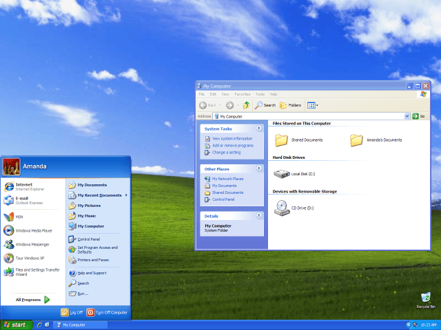
Windows XP (Luna UI & Bliss)
Microsoft's iconic blue and green interface featuring glossy bevelled titlebars, tactile taskbar buttons, and realistic 3D icons.
Early web designers borrowed textures, shadows, and metaphors from the physical world — beveled buttons, metallic headers, and Flash-driven chrome — to make unfamiliar websites feel intuitive and trustworthy.
As the commercial web matured from hobby pages to venture-funded storefronts, most visitors had never shopped or browsed online before. Skeuomorphism on the web — designing page elements to resemble real-world objects — answered that gap. Tabbed navigation mimicked file folders. Product grids used book-cover and catalog metaphors. Macromedia Flash 4, 5, and MX enabled cinematic intro sequences with glossy 3D buttons, while CSS2 introduced positioning, backgrounds, and box shadows for beveled navigation bars built without plugins. Amazon and eBay pioneered trust-building e-commerce layouts; dot-com portals wrapped content in heavy metallic headers and pressable chrome. Even Apple's early web presence — brushed-metal graphics on apple.com and the iTunes web storefront — exported desktop-software aesthetics into HTML. The curatorial thesis was simple: when users lacked web literacy, familiar visual affordances taught them where to click.
2001 – 2007
The early commercial web had to teach people how to click. Designers borrowed from physical retail and desktop software — tabbed navigation like file folders, product grids like book covers, buttons beveled to look pressable, metallic headers like control panels.
Macromedia Flash powered the era's most cinematic pages; CSS2 brought bevels and shadows to HTML. When users lacked web literacy, familiar metaphor was usability.
The early commercial web learned to look tangible — Flash intro pages, beveled navigation, and e-commerce storefronts that borrowed metaphors from retail catalogs and desktop software chrome.
Microsoft's iconic blue and green interface featuring glossy bevelled titlebars, tactile taskbar buttons, and realistic 3D icons.
Grey toolbar frames, inset URL bars, and 3D beveled navigation that taught users to browse.
Cinematic 3D web experiences with glossy buttons and mandatory intro sequences.
800×600 CRT displays and 56k modems — the hardware context for texture-heavy early web pages.
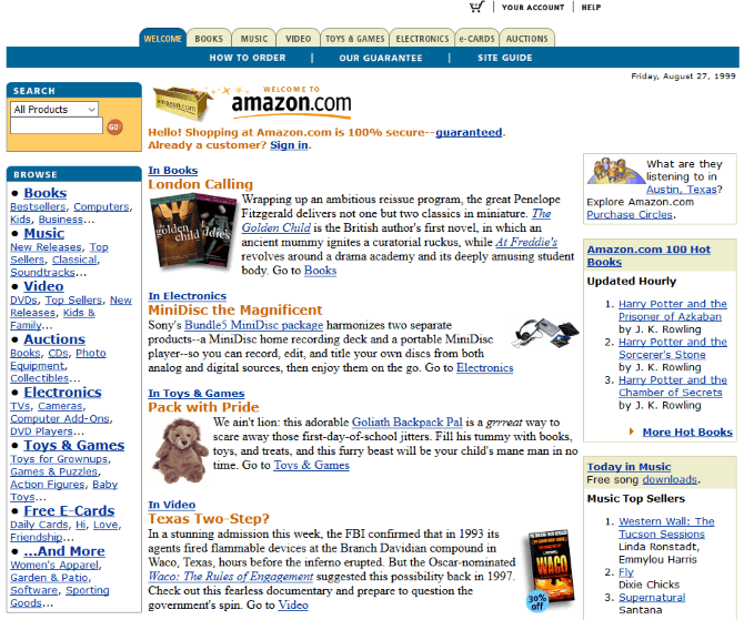
Tabbed navigation, book-cover grids, and catalog metaphors for first-time online shoppers.
Auction listing grids, category tabs, and bid-button chrome on the early commercial web.
Heavy 3D beveled buttons, drop shadows, and metallic web headers on venture-funded homepages.
Brushed-metal web graphics and album-grid storefront chrome in the browser.
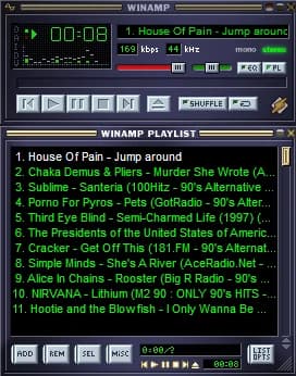
Brushed-metal chassis with green digital LED timer and spectrum analyzer display mimicking physical audio hardware.
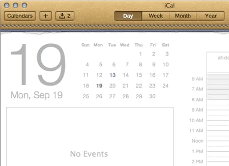
Leather stitching texture and torn-paper header edges translating physical desktop calendars to digital interfaces.
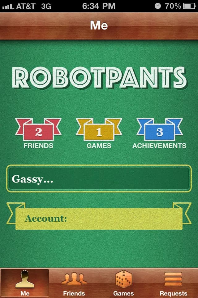
Casino green felt table texture, brass badges, and carved wood trims.

Iconic brushed aluminum casing with metallic volume dials and tactile transport controls.
As the commercial web matured from hobby pages to venture-funded storefronts, most visitors had never shopped or browsed online before. Skeuomorphism on the web — designing page elements to resemble real-world objects — answered that gap. Tabbed navigation mimicked file folders. Product grids used book-cover and catalog metaphors. Macromedia Flash 4, 5, and MX enabled cinematic intro sequences with glossy 3D buttons, while CSS2 introduced positioning, backgrounds, and box shadows for beveled navigation bars built without plugins. Amazon and eBay pioneered trust-building e-commerce layouts; dot-com portals wrapped content in heavy metallic headers and pressable chrome. Even Apple's early web presence — brushed-metal graphics on apple.com and the iTunes web storefront — exported desktop-software aesthetics into HTML. The curatorial thesis was simple: when users lacked web literacy, familiar visual affordances taught them where to click.
W3C CSS2 introduces positioning, backgrounds, and borders — enabling beveled navigation bars, drop shadows, and table-free layout experiments on the early commercial web.
Flash becomes the dominant platform for cinematic intro pages, 3D beveled buttons, and interactive portfolio sites that defined high-budget web design.
Venture-funded storefronts invest in polished, familiar interfaces — tabbed catalogs, product-cover grids, and glossy checkout flows — to signal credibility to first-time online shoppers.
Flash MX deepens ActionScript interactivity while Yahoo!, MSN, and startup portals adopt heavy 3D beveled headers and metallic navigation across their homepages.
Apple's website adopts Aqua-inspired brushed-metal textures and pressable web buttons — exporting native software chrome into mainstream HTML design language.
Apple launches the iTunes Music Store on the web with metallic album-grid chrome; simultaneously, the Web Standards Project gains momentum, planting seeds for the flat, semantic HTML reaction.
The dominant platform for animated, skeuomorphic web experiences — cinematic intros, 3D buttons, games, and designer portfolios with textured chrome.
E-commerce pioneers whose tabbed storefronts, product-cover metaphors, and catalog grids prioritized trust signals for new online shoppers.
Essential tools for slicing beveled buttons, metallic headers, and pixel-crafted web graphics before CSS could replicate them natively.
Brushed-metal web graphics and album-grid storefronts that brought desktop software aesthetics into HTML — a reference point for premium web chrome.
Most users were still learning how the web worked. Familiar visual metaphors — tabs, buttons that looked physically pressable, shopping layouts that echoed retail catalogs — reduced cognitive load and increased trust, critical for e-commerce adoption. Flash made impressive web experiences possible on dial-up connections; businesses used rich visuals to appear established and professional in a crowded dot-com landscape.
Flash was proprietary, inaccessible to screen readers, and performance-heavy on dial-up and early broadband. Users became more web-literate and no longer needed a physical stand-in for every link or button. The Web Standards Project and semantic HTML/CSS advocates pushed for simpler, faster, more maintainable pages. When the dot-com bubble burst, bloated intro animations and texture-heavy pages came to symbolize excess rather than credibility.
Web 2.0 glossy design with CSS3 gradients, rounded corners, and community-driven layouts from 2003 onward — eventually giving way to flat design as users and devices demanded speed and clarity.
This stream documents the early-web chapter of digital skeuomorphism specifically; the design principle is much older, and its most prominent interface phase came later, in the mobile era — Apple's iOS from 2007 through iOS 6 (with linen, felt, leather and glass textures) until the flat redesign of iOS 7 in 2013. Even so, early web skeuomorphism taught a generation that interfaces must communicate affordance — how something can be clicked or navigated. E-commerce patterns born in this era (tabs, product grids, trust badges) persist today in simplified form, and the backlash against Flash intros and heavy texture directly catalyzed the web standards movement and cleaner Web 2.0 aesthetics.
Designer and agency sites built entirely in Flash with cinematic transitions, 3D buttons, and textured chrome — often with mandatory "Skip Intro" links.
Tabbed navigation and book-cover product grids that made online shopping feel like browsing a physical store.
Yahoo!, startup homepages, and corporate portals wrapped in heavy 3D beveled navigation and metallic header bars.
Brushed-metal web graphics and album-cover grids that brought Apple's premium software aesthetic to the browser.