
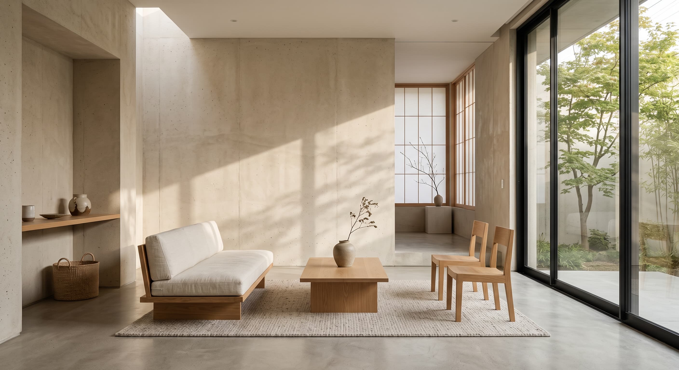
Studio Object
Ceramic Vessel No. 04
One photograph, one measure of type, and the space between — hierarchy without decoration.
Web Design Era
2015 – Present
Reduction as the interface — whitespace, type, and almost nothing else
A durable mid-2010s–present web design direction that treats emptiness, alignment, and typography as the primary materials. It follows Skeuomorphism’s glossy peak (roughly 2008–2012) and Flat Design’s functional transition (2012–2014), settling into Swiss-grid restraint, extreme whitespace, and editorial stillness rather than saturated Metro planes.
Web Design / Visual Culture
Explore exhibitsInteractive
Toggle layers to feel how Minimalism subtracts — stopping the moment before meaning disappears.
Studio Object
One photograph, one measure of type, and the space between — hierarchy without decoration.
Level 0: Full Composition
Gallery
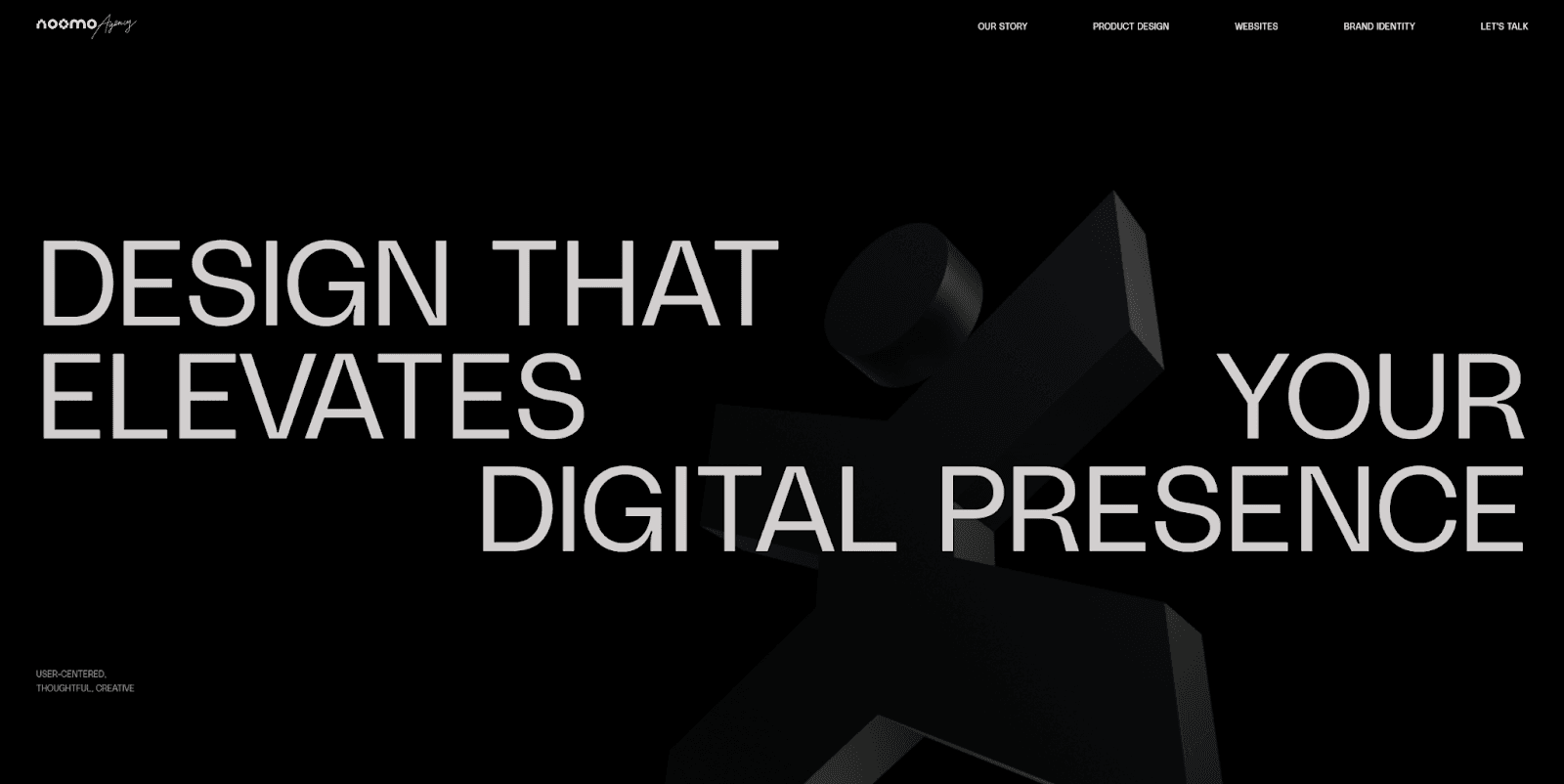
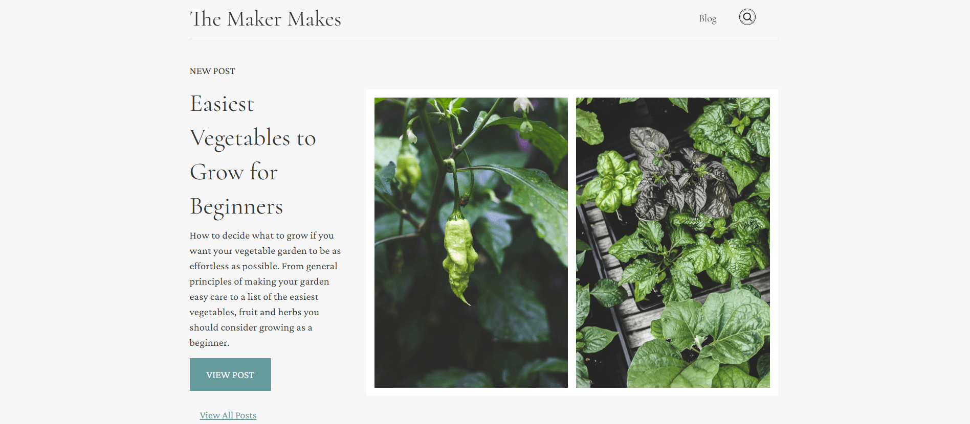
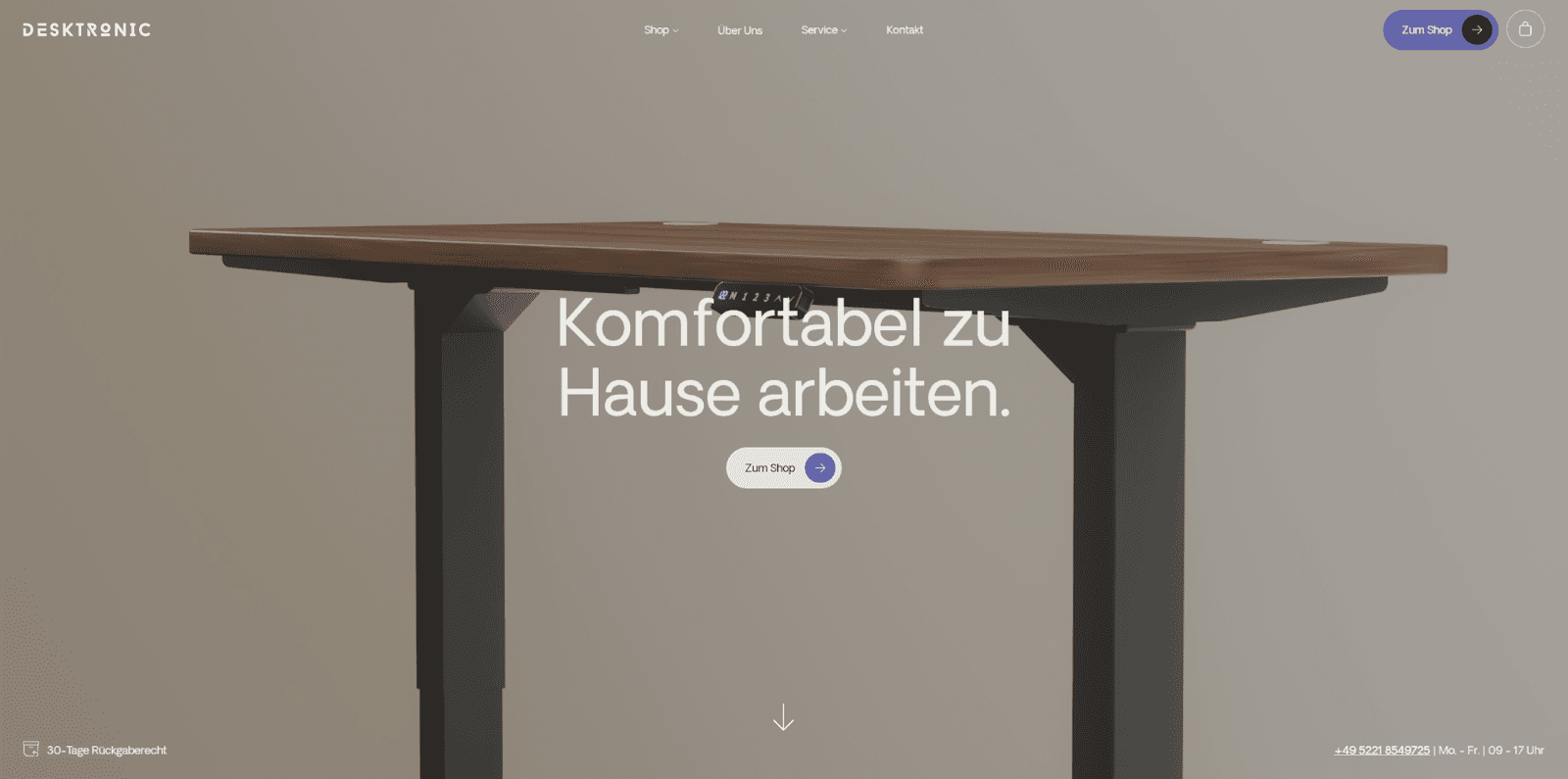
Four live specimens of reduction on the contemporary web: agency platforms, studio portfolios, healthcare interfaces, and product commerce — each organised through whitespace, type, and restraint.

Characteristics
Empty space groups content. Silence is structural, not leftover margin.
Hierarchy lives in size and tracking — not coloured chips or heavy weights.
Alignment is the invisible structure. Edges share verticals; images lock to the measure.
If removing a border or card does not hurt understanding, Minimalism removes it.
Chapter
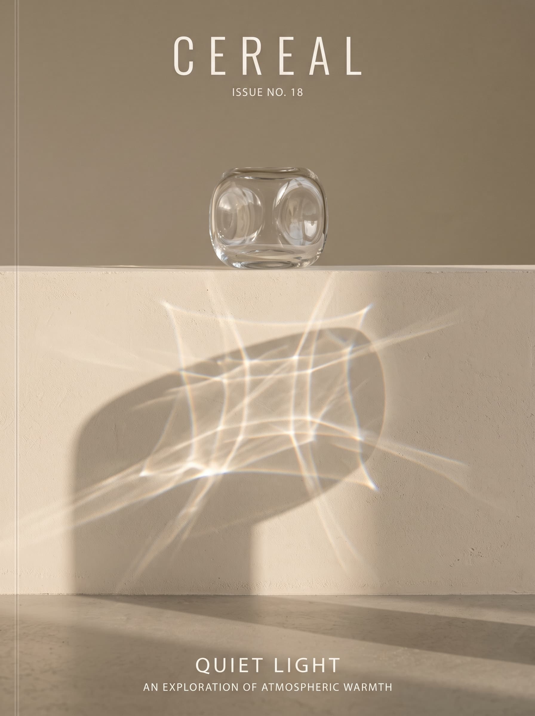
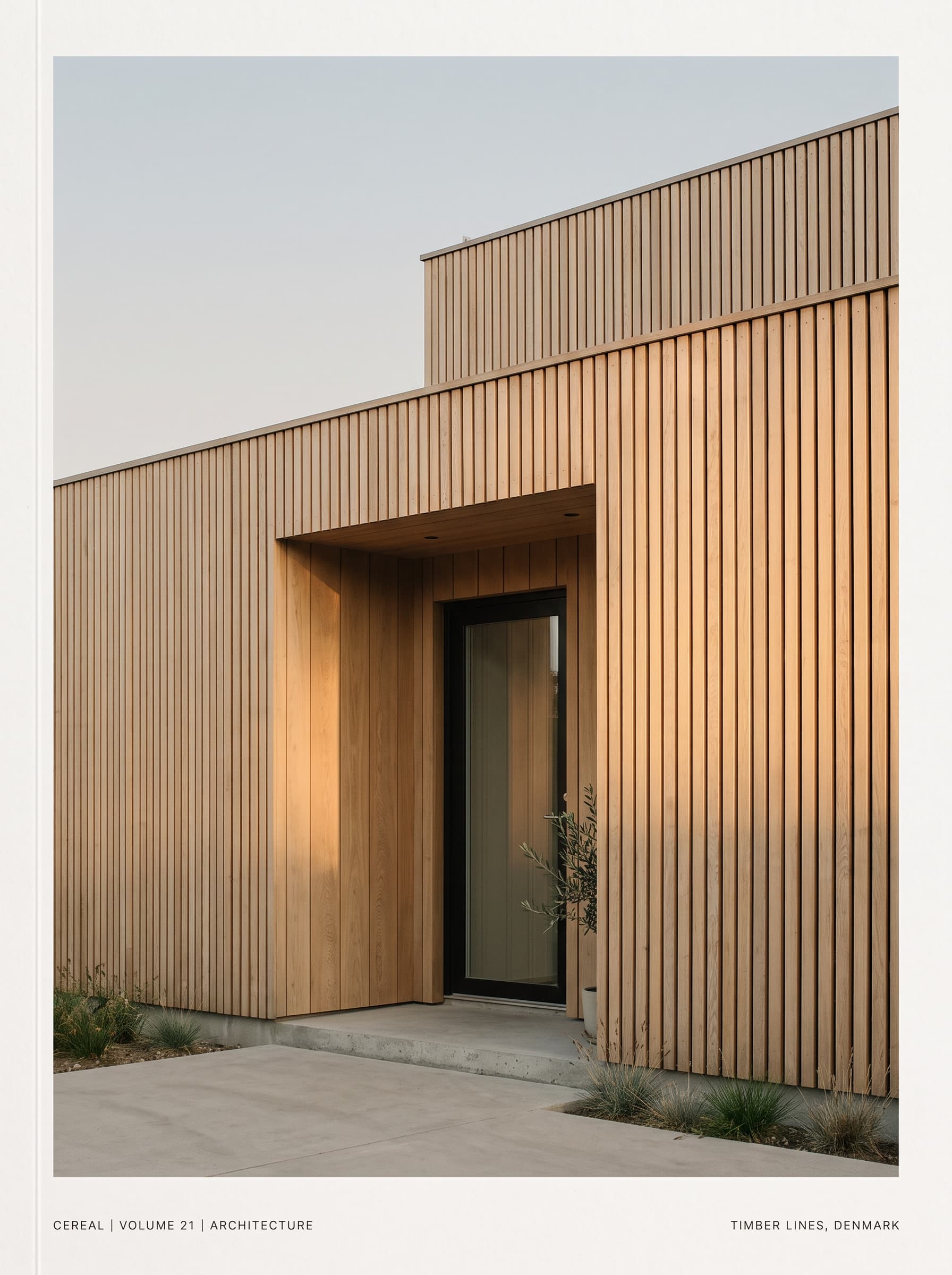
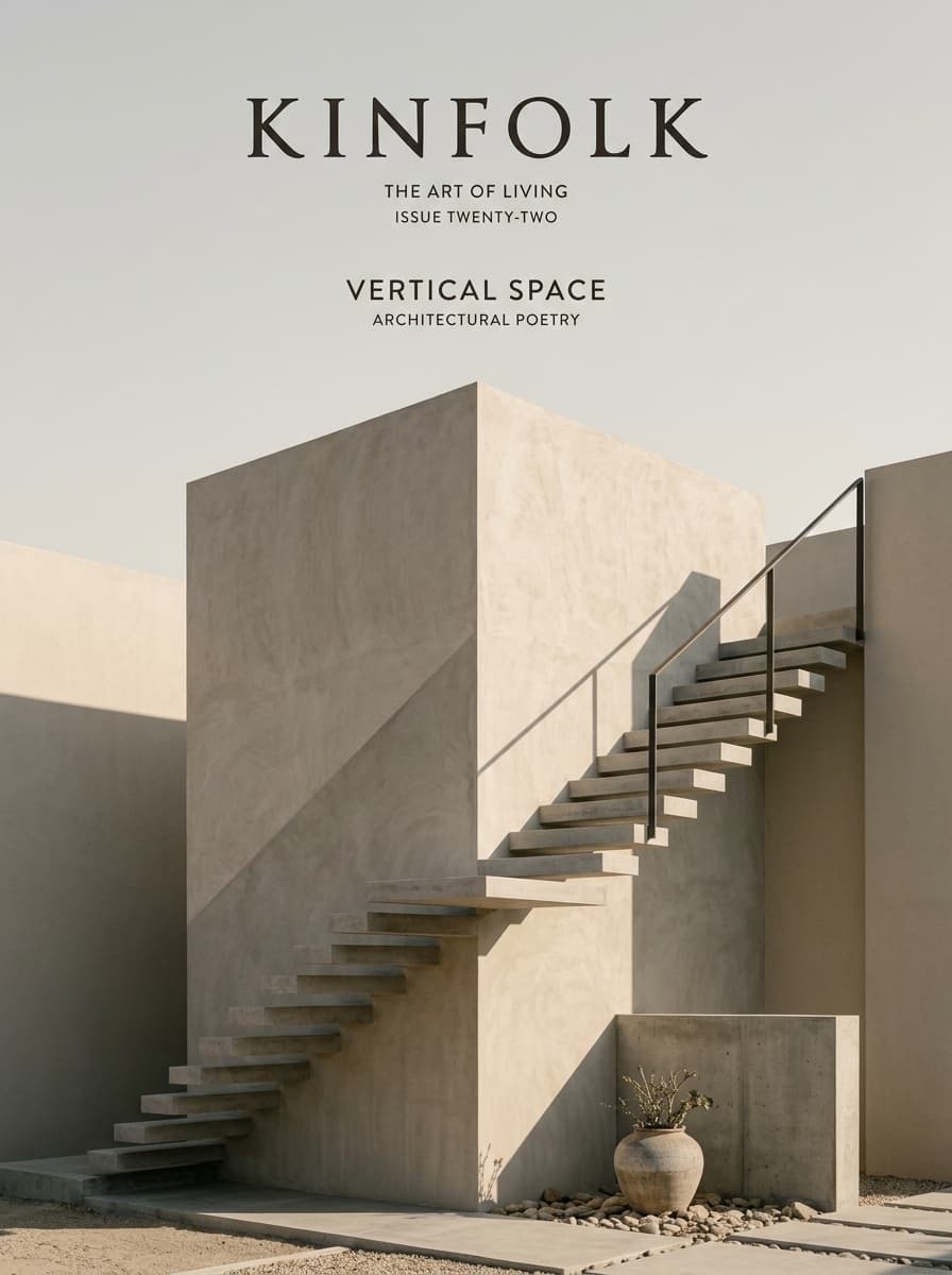
Minimalism did not arrive on the web as a sudden style drop in 2008 — that year still belonged to skeuomorphic chrome and glossy UI. As a broader design philosophy it descends from mid-century art and architecture, from International Typographic Style discipline, and from product cultures that prize clarity over ornament. On the early commercial web, reduction often looked like necessity — limited bandwidth, few fonts, sparse pages — rather than ideology. Through the late 2000s, glossy gradients and skeuomorphic materials remained the default of “professional.” Flat Design (Metro, then iOS 7) cleared ornament with bold colour and pictograms around 2012–2014. Modern Digital Editorial Minimalism crystallised afterward: from about 2015 onward, portfolios, studios, and design-led product sites converged on Kinfolk/Cereal-adjacent quietude — Swiss grids, Japandi/spatial restraint, large margins, thin rules, limited palettes, and typography that carries hierarchy without decoration. It is an ongoing language rather than a closed decade — still readable whenever a product team chooses silence over spectacle.
Chapter
Reductionism in sculpture, architecture, and graphic systems establishes “less” as a deliberate aesthetic stance — decades before it becomes a recognisable web look.
Physical metaphors, bevels, and high-gloss chrome dominate mainstream interfaces. Sparse pages exist as exceptions or precursors — not yet the editorial Minimalist web language of the mid-2010s.
Metro and iOS 7 popularise flat colour, icon systems, and anti-skeuomorphic clarity. The field empties of ornament, but often fills again with saturated planes — a sibling path to quieter Minimalism.
Studio portfolios, craft brands, and design-led sites converge on Swiss grids, extreme whitespace, thin frames, restrained imagery, and Kinfolk/Cereal-adjacent stillness as a web craft language.
Content platforms, documentation sites, and spatial/Japandi-influenced brands keep shipping pages where the grid and empty space do most of the compositional work — ongoing through the present.
Chapter
Long-running public example of extreme reduction: one primary action, vast empty field, almost no chrome — restraint as product strategy.
Product photography and short lines of type staged in large silence; hierarchy carried by scale and spacing rather than panels and ornaments.
Architecture, interior, and design studios normalised asymmetric text/image compositions with thin frames and measured captions.
Reading-first surfaces that strip chrome down to type measure, margins, and a few restrained controls.
Chapter
Generous negative space used as a structural material, not leftover margin
Limited palette — typically warm white / near-black, optionally one muted accent
Typography as hierarchy: open tracking on labels, restrained display weights
Thin 1px rules, open geometric frames, and hairline dividers
Asymmetric but tightly aligned compositions
Imagery carefully cropped and framed — rarely tiled or collaged
Flat surfaces without glass, gloss, or soft elevation theatre
Interaction that is subtle: opacity, underline, or border — never bounce
Chapter
It photographs cleanly, loads lightly, and signals confidence: the page does not compete with the content. For museums, studios, and products that sell clarity, silence is a stronger brand cue than another decorative system.
Chapter
It has not declined so much as been diluted. “Clean white page” became a default template language, and carelessly applied Minimalism collapses into empty SaaS sameness — large type, no history, no composition. The distinctive craft is intentional framing and hierarchy, not merely removing colour.
Chapter
Nothing single-handedly replaced it. Competing languages (Flat Design colour systems, Material elevation, glass and aurora atmospheres) offered louder alternatives, while Minimalism remains available whenever a team chooses restraint.
Chapter
Web Minimalism taught generations of designers that emptiness can be compositional, that type can replace chrome, and that a thin line can do the work of a panel. Its lasting contribution is a usability ethic: remove noise until the next removal would remove meaning.
Chapter
Near-empty viewports organised around one primary input — early reduction as product identity (a precursor, not yet editorial Minimalism).
Full-bleed or carefully framed images paired with sparse typography and almost no secondary modules in the first viewport.
Editorial compositions: text measure on one side, framed image on the other, hairline geometry holding the alignment.
Chapter
Minimalism on the web is often confused with Flat Design; Flat Design fills the field with colour and icons, while Minimalism often empties it.
Dating Minimalism to 2008 confuses it with the skeuomorphic/glossy peak — modern editorial Minimalism is a mid-2010s response after Flat Design cleared the ornament.
Swiss graphic design and International Typographic Style are influences, not synonyms — web Minimalism also absorbs product-marketing silence and editorial framing.
The hardest Minimalist craft problem is usually hierarchy without chrome: if everything is quiet, the one loud thing must be intentional.
A page can be white and still fail Minimalism — cluttered cards, weak alignment, and decorative emptiness are not the same as reduction.
Related