Resting card · 1dp
Surfaces sit on the background plane. Content is ink on paper — no ornament beyond elevation.
2014 – Present · Paper & ink
Paper, ink, elevation, and meaningful motion
Google's systematic design language that unified web, Android, and product UI through elevation, bold color, motion, and design tokens.
Module 1 · Material 1.0
Material Design modeled UI as sheets of digital paper. Elevation shadows define hierarchy; ripples are ink spreading from the point of contact. Hover a card — it lifts. Press a button — ink expands.
Surfaces sit on the background plane. Content is ink on paper — no ornament beyond elevation.
Primary actions lift on hover. The Z-axis is the only depth Material allows.
When a card is “held,” shadow blur expands and the plane translates toward the viewer.
Click for ink ripple
Module 2 · Evolution
The same UI component across three eras: rigid elevation (M1), soft theming & rounded corners (M2), and dynamic colour with tonal surfaces (M3).
Inbox
SearchGoogle Design
10:24
Material guidelines update
Android Team
Yesterday
Lollipop preview builds
Play Store
Mon
Your app is live
Square corners, strong 2–8dp shadows, bold Blue/Pink primary pair.
Google's systematic design language — paper, ink, elevation, and motion as a unified cross-platform vocabulary.
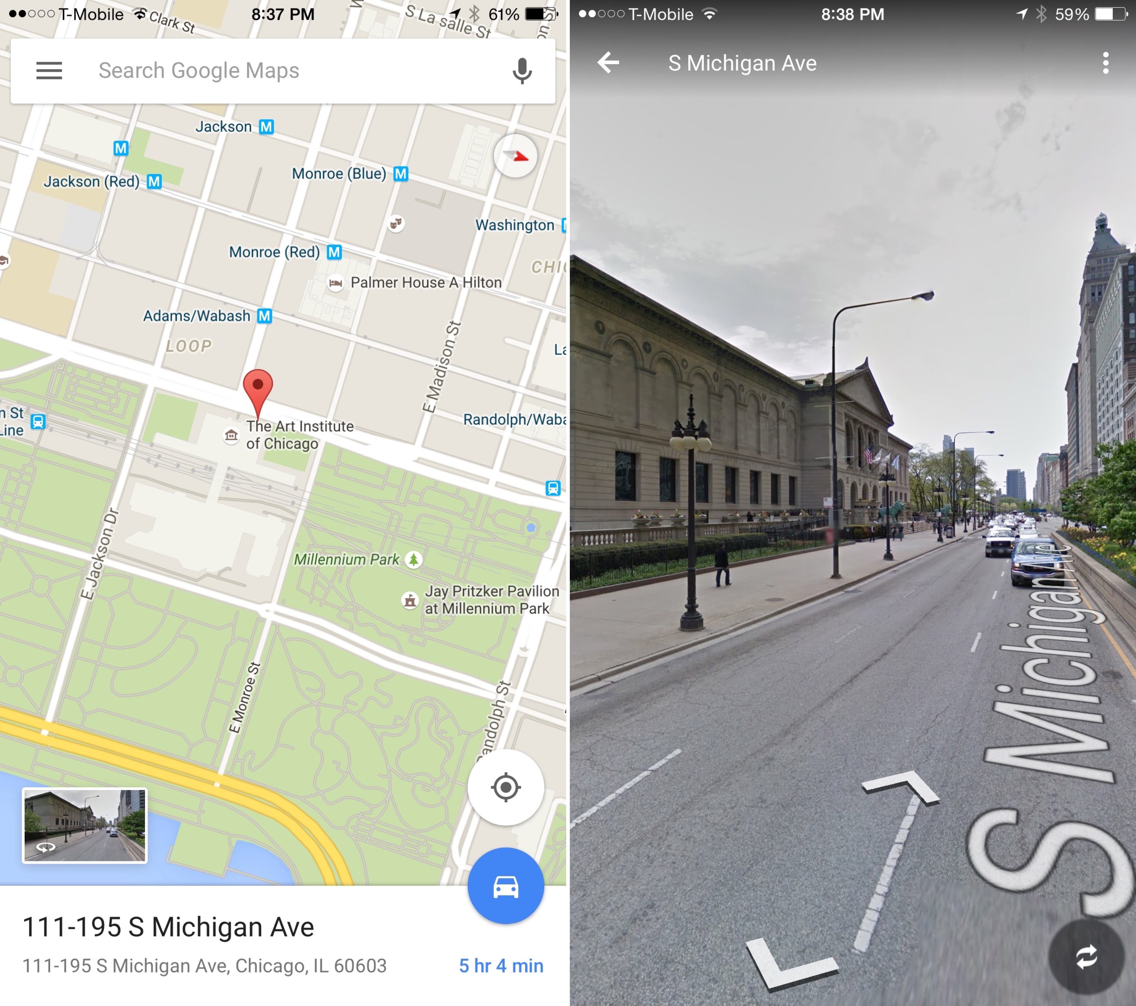
Layered bottom sheets, floating search bars, and spatial elevation transitions.
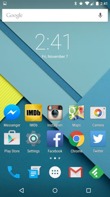
Colorful status bars, ripple touch feedback, and card-based task switchers.
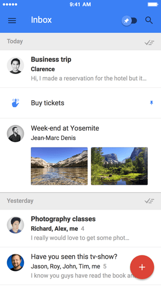
Bold Floating Action Buttons (FABs), email bundle cards, and sweep animations.
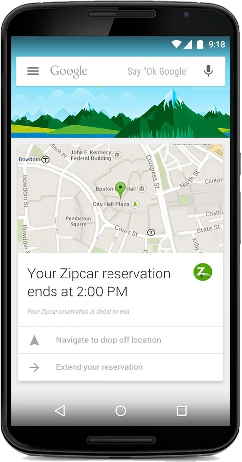
Predictive information cards sliding over a layered canvas that inspired Material's paper metaphor.
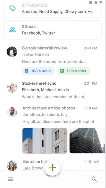
Rounded card containers, custom sidebars, and persistent compose FABs.
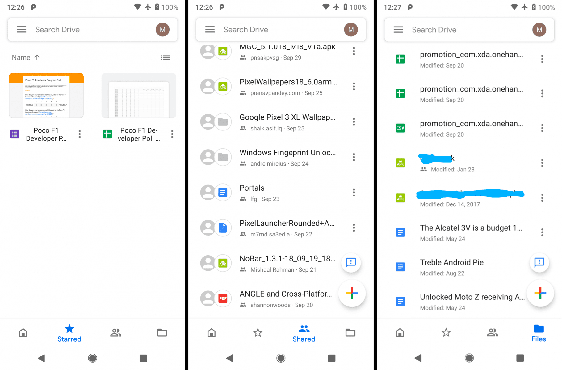
Clean elevated file cards, subtle drop shadows, and responsive navigation rails.
After flat design stripped digital interfaces down to unadorned surfaces, Google introduced Material Design in 2014 as a principled, physics-inspired visual language that reintroduced depth, light, and tactile affordances. The system evolved across distinct eras: Material 1.0 (2014) established rigid paper and ink physics, 2dp card resting elevation shadows, ripple feedback, and Google's vibrant primary Blue (#2196F3) palette. Material 2.0 (2018 / Material Theming) modernized the aesthetic with rounded surface geometry, curved floating sheets, and a signature primary Purple (#6200EE) palette across flagship products like Gmail and Google Maps. Later, Material You (2021+) introduced dynamic algorithmic color extraction. By standardizing design tokens and motion choreography, Material shaped modern cross-platform design systems.
Predictive card stack pioneers the tactile elevated paper surface metaphor two years before Material's formal launch.
Google introduces paper/ink physics, 2dp card shadows, primary Blue (#2196F3) palette, and unified cross-platform guidelines.
Reusable component libraries for web, Android, iOS, and Flutter accelerate adoption.
Customizable design tokens, rounded surfaces, and primary Purple (#6200EE) allow expressive brand adaptation across Google products.
Dynamic color from wallpaper and increased personalization redefine the system.
Creator and primary adopter across Gmail, Maps, Drive, and Android.
The most popular React component library implementing Material Design for the web.
Google's UI toolkit with built-in Material widgets for cross-platform apps.
Sketch was the primary platform during Material Design 1 & 2 (featuring the official Material Theme Editor plugin in 2018), while Figma later became the industry standard for Material You design systems.
Elevation shadows indicating surface depth
Bold primary colors with accent highlights
Floating Action Buttons (FABs)
Card-based content containers
Meaningful motion and shared element transitions
Roboto typography and systematic spacing grids
Teams needed a shared language across platforms. Material provided free, comprehensive documentation and code components. It solved flat design's affordance problems with principled depth. Google's scale meant millions of Android users experienced it daily, normalizing the patterns.
Material never went away — it remains Android's system design language — but its role as a differentiator receded. It became visually recognizable to the point of sameness (“every app looks like Google”), so brands sought distinction; iOS and custom design systems offered alternatives. Material You (2021) shifted the emphasis from a single uniform look toward per-user dynamic colour, and by the early 2020s the classic card-and-shadow signature felt less distinctive as bento layouts and AI interfaces spread.
Not replaced so much as continued and diversified. Material is still actively developed — Material You / Material 3 (2021) and Material 3 Expressive (2025) — while AI-first bento UI, glassmorphism accents, and heavily customized design systems increasingly borrow its token architecture without adopting its visual signature.
Material Design popularized design tokens, component libraries, and documentation-first design systems. Elevation, motion principles, and accessibility guidelines influenced industry standards beyond Google. MUI, Angular Material, and Flutter Material remain widely used.
2014
Layered bottom sheets, floating search pills, and spatial elevation transitions.
2014
First OS built entirely on Material Design with ripple touch feedback and card switchers.
2018
Material Theming brought to billions of users with rounded containers and persistent FABs.
Google Now (2012) served as the direct precursor and pre-Material origin, pioneering the card-stack paradigm two years before the official 2014 launch.
The FAB (Floating Action Button) became one of the most debated UI patterns in design history.
Material Design has its own official color tool for generating accessible palettes.
Some designers called Material “skeuomorphism with rules” — depth, but systematic.