2004 – 2013
Frutiger Aero
Glossy nature, skies, and techno-optimism
A visually lush aesthetic combining glossy surfaces, nature imagery, blue skies, green grass, and translucent “aero” glass effects.
Interactive Experience
Step Into the Frutiger Aero Desktop
Leave the museum gallery and boot into a full late-2000s techno-optimistic desktop — complete with Aero Glass windows, lush nature wallpapers, and nostalgic UI chrome from the height of glossy optimism.
- A full Windows 7 Aero desktop with glass windows and nature wallpapers
- Glass taskbars, live-style window chrome, and period-accurate sounds
- Explorable apps, wallpapers, and Frutiger-era interface details
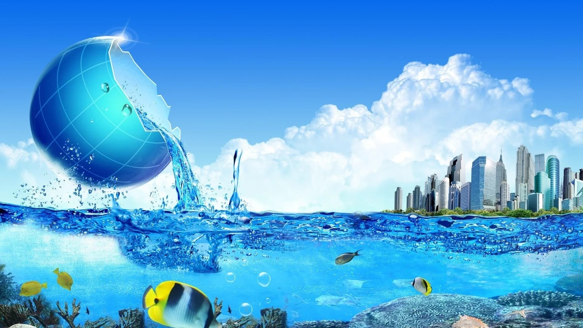






Welcome to Windows Aero
- Discover Aero Glass UI
- Change Desktop Backgrounds
- Interactive Sound & Widgets
Sunny
72°F
Seattle, WA
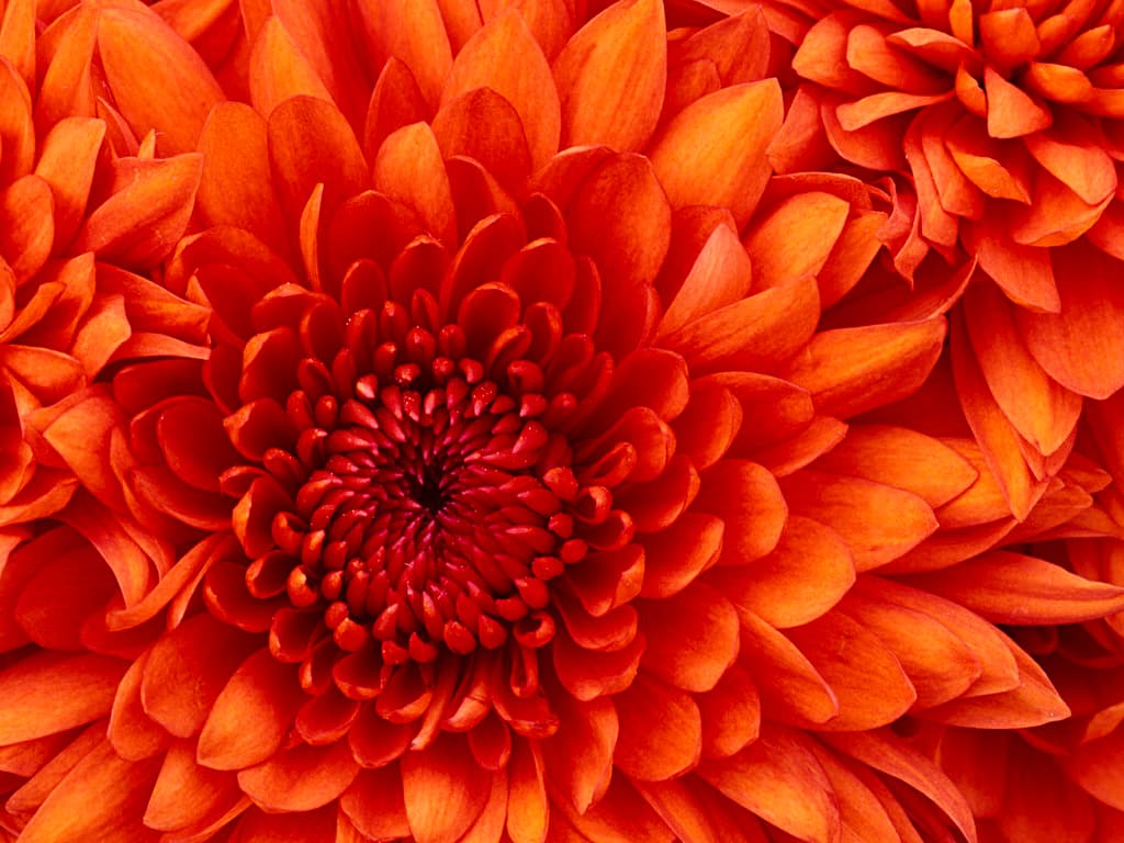
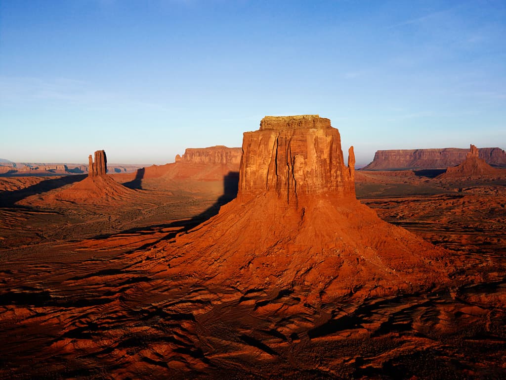




Representative interfaces, products, and artifacts from this era
Windows Media Player 11 · Library
A gallery of glossy optimism — translucent OS chrome, nature imagery, and the techno-utopian interfaces of the late 2000s.
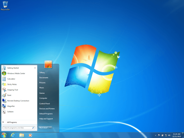
Windows 7 Aero
Refined glass effects and a polished taskbar marked Aero's peak.
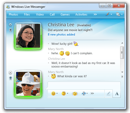
Windows Live Messenger (2009)
The peak of social techno-optimism featuring glassy contact cards, custom emoticons, status bubbles, and vibrant aero-blue gradients.
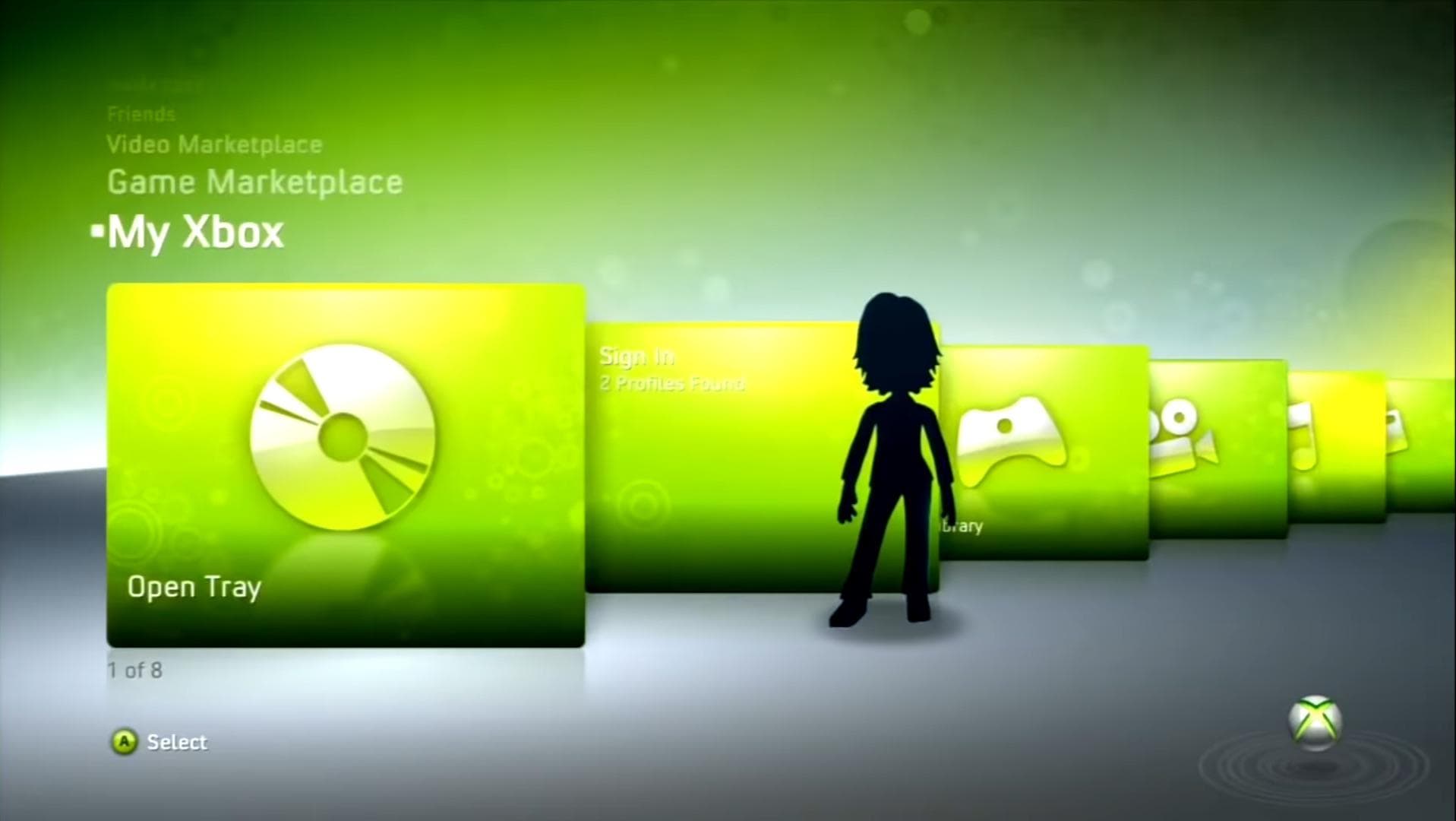
Xbox 360 Dashboard
Blade-style navigation with glossy panels and ambient motion backgrounds.
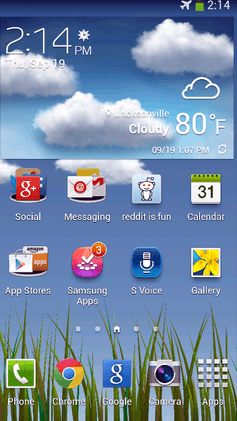
Samsung TouchWiz
Android skin with nature wallpapers and glossy icon treatments.
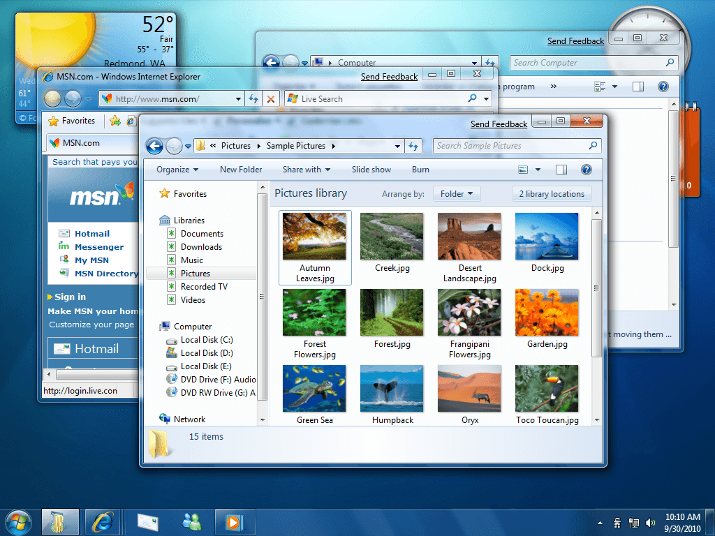
Windows 7 Aero UI Chrome
Close-up glass window frames, soft shadows, and the luminous Win7 control buttons.
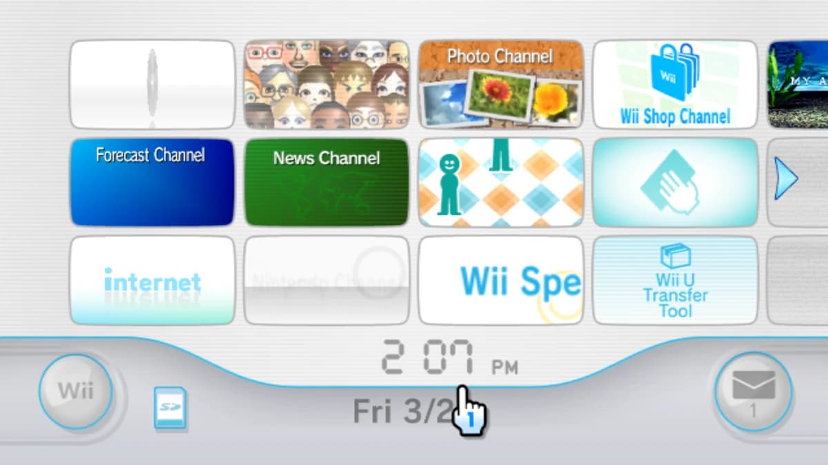
Nintendo Wii Menu
Channel grids, soft drop shadows, and the living-room Aero of motion controls.
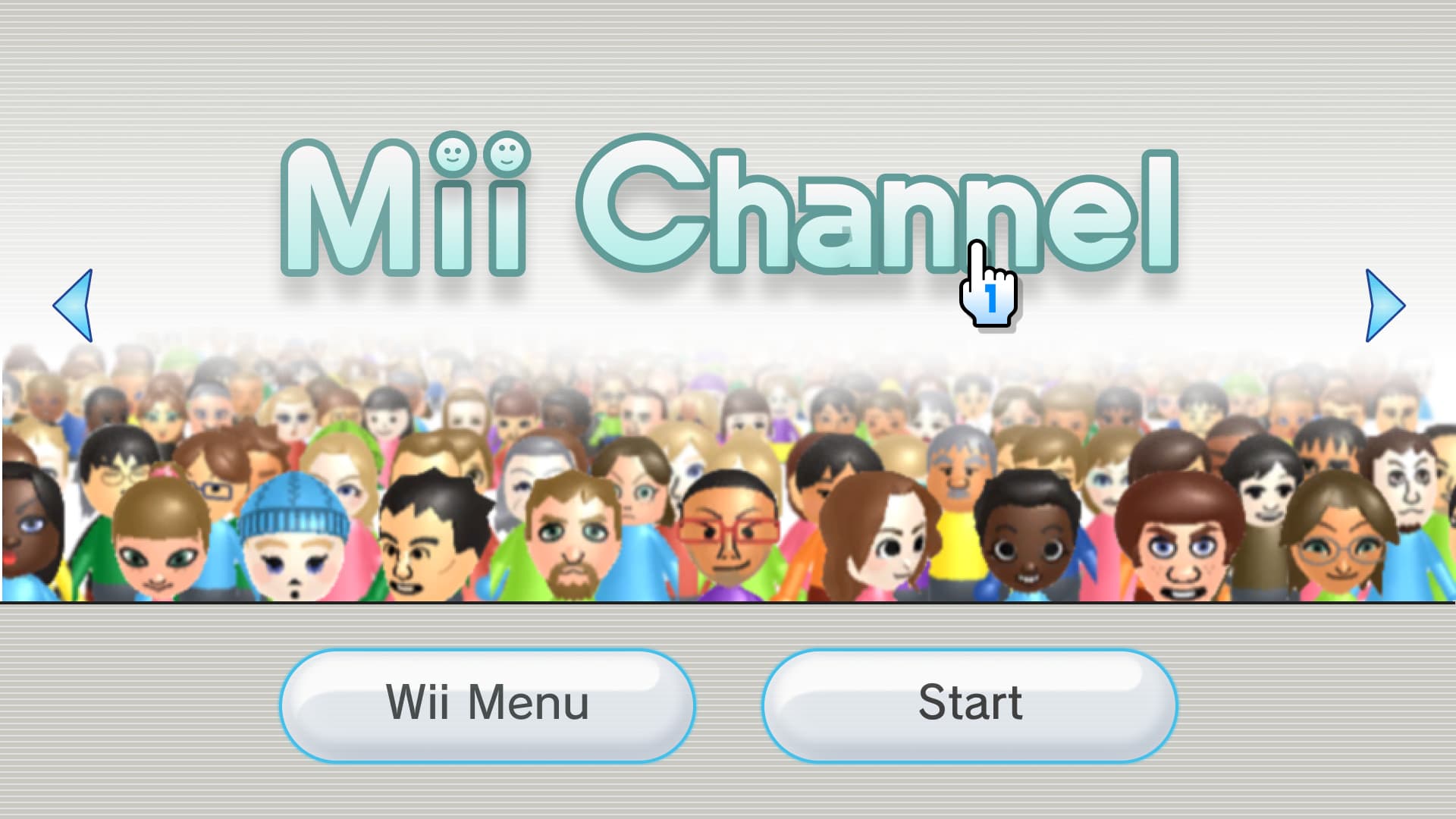
Nintendo Wii Channel
Channel splash screens with glossy tiles, soft blues, and friendly iconography.
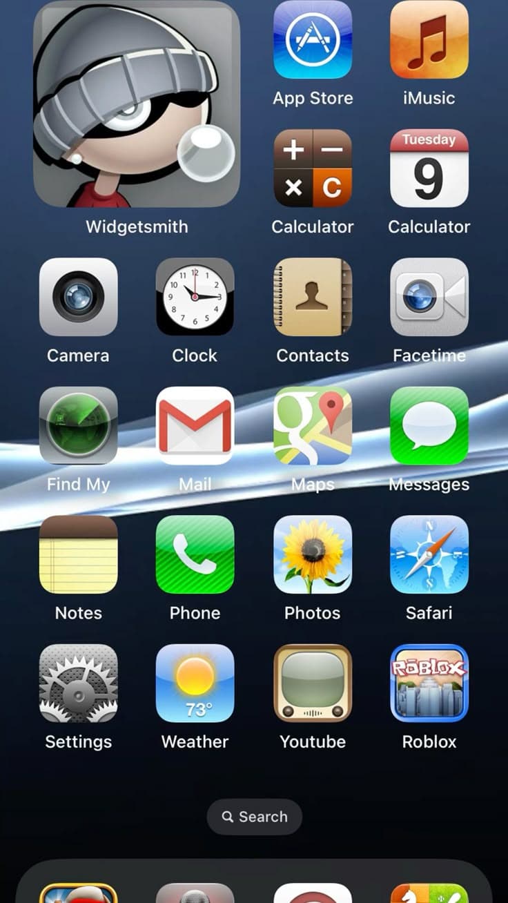
iOS (Frutiger / Skeuomorphic Era)
Glossy app icons, leather and felt textures, and pre–iOS 7 skeuomorphic chrome.
Historical Background
Frutiger Aero — named after the Frutiger font and Windows Aero glass effects — describes a broad cultural aesthetic spanning OS design, advertising, stock photography, and web interfaces from roughly 2007 to 2013. It expressed techno-optimism: nature and technology in harmony, blue skies, lush greenery, lens flares, bokeh, and glossy translucent panels. Windows Vista and 7, early Android skins, and corporate marketing all embraced this look. On the web, it manifested as gradient backgrounds, glass panels, and nature-inspired hero imagery.
Timeline
Aero Peek
2007
Windows Vista Aero launches
Translucent window chrome and glossy effects set the tone for OS design worldwide.
Aero Peek
2007
iPhone redefines mobile UI
Apple's skeuomorphic iOS coexists with Aero-inspired web marketing aesthetics.
Aero Peek
2009
Windows 7 refines Aero
Cleaner glass effects and taskbar previews peak the aero aesthetic in mainstream OS design.
Aero Peek
2010
Skeuomorphic iOS peaks
Apple's rich textures coexist with Aero-influenced web advertising and stock imagery trends.
Aero Peek
2013
iOS 7 flat redesign
Apple's dramatic shift signals the end of glossy, textured design across the industry.
Key Visual Characteristics
- Glossy, translucent glass-like panels
- Nature imagery — skies, grass, water, aurora
- Lens flares, bokeh, and light streaks
- Bright blues and greens with white highlights
- Rounded, friendly shapes with soft shadows
- Stock photo aesthetics in marketing and hero sections
Major Companies & Products
Microsoft Windows Aero
ProductThe defining glass/translucent UI of Windows Vista and 7 that named the movement.
Samsung TouchWiz
ProductAndroid skin with glossy icons, nature wallpapers, and bright, optimistic palettes.
Shutterstock & iStock
PlatformStock photo libraries flooded with lens flares, green hills, and blue sky composites.
Spotify (early branding)
ProductVibrant green identity with glossy, energetic marketing aligned with the era's optimism.
Why It Became Popular
It visually promised a better, cleaner, more harmonious future — powerful messaging after economic uncertainty. OS vendors used glass effects to showcase hardware capabilities. Cheap stock photography made the aesthetic accessible to any marketing team. The look felt premium without requiring custom illustration.
Why It Declined
Flat design offered faster performance and better mobile scaling. Users tired of visual excess and stock photo sameness. Windows 8 abandoned Aero for flat tiles. Apple's iOS 7 redesign gave cultural permission to strip ornamentation. The aesthetic became associated with corporate blandness and outdated technology.
What Replaced It
Flat design and Material Design, which replaced glossy nature optimism with bold color, typography, and systematic design tokens.
Legacy & Long-Term Impact
Frutiger Aero lives on in vaporwave, webcore nostalgia, and intentional retro redesigns. Glass effects returned in glassmorphism (2020s). The era's environmental imagery influenced how tech companies communicate sustainability. Windows 11 subtly revived translucent materials.
Famous Examples
Windows 7 default wallpapers
2009
The iconic glowing Windows logo on a blue aurora background.
Wii System Menu
2006
Channel grid with glossy rectangles and friendly, nature-adjacent warmth.
Corporate “green tech” campaigns
2010
Wind turbines, green hills, and blue skies dominated B2B technology marketing.
Interesting Facts
- The name “Frutiger Aero” was coined retroactively by internet culture, not by designers at the time.
- The aesthetic overlaps with “McMansion Unicode” and early 2010s corporate optimism.
- Many people feel deep nostalgia for this era despite criticizing it when it was current.
- Frutiger (the font) was widely used in airport signage — hence the connection to travel and openness.