Software2019 – Present
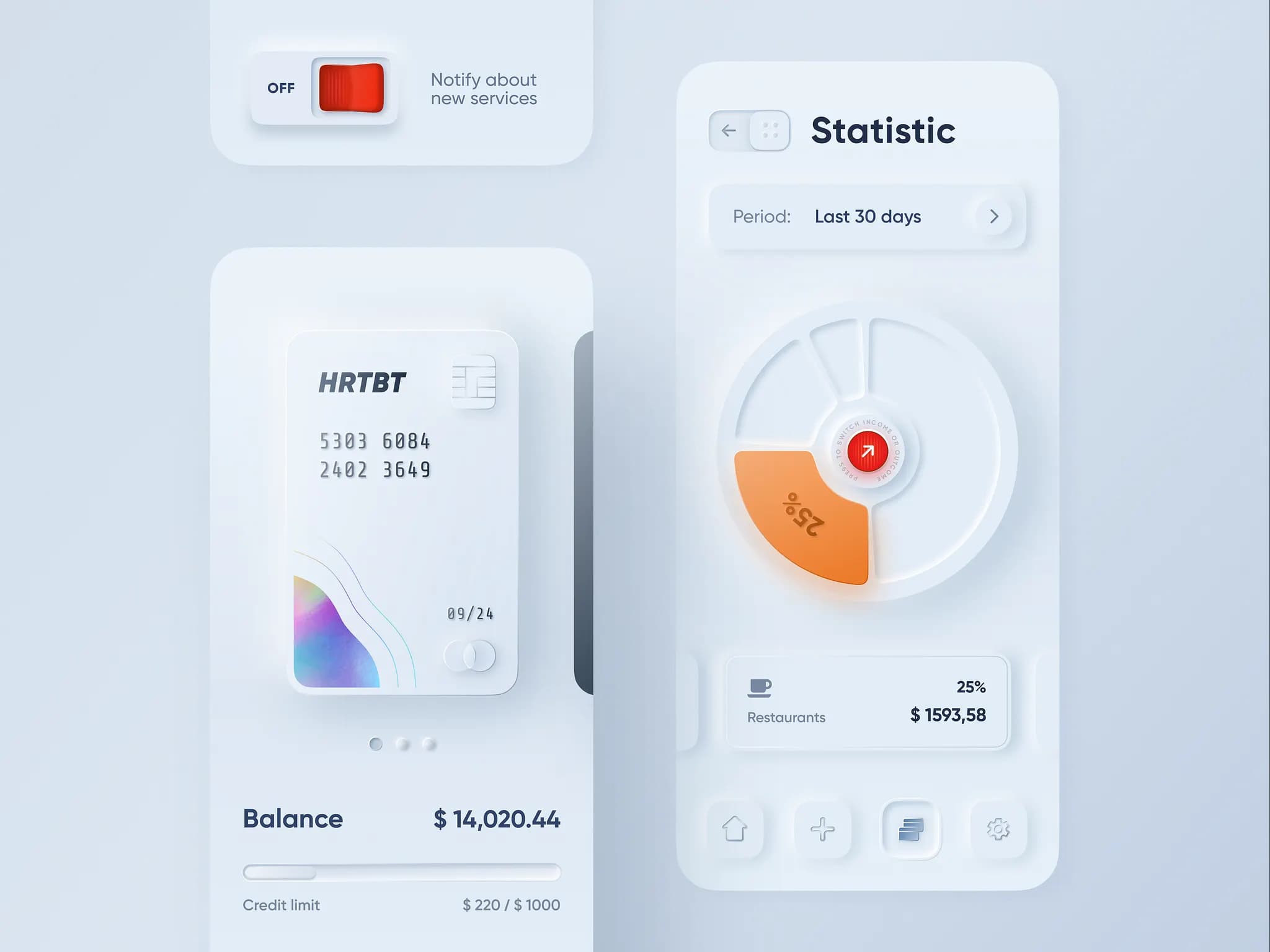
Alexander Plyuto Mobile Banking
The viral Dribbble concept shot ("Skeuomorph + Flat = Neumorphism") that sparked the Soft UI movement.
A short-lived trend where UI elements appeared to extrude from or press into a soft monochromatic background using dual shadows.
2019–2021 · Soft extruded surfaces · Dual-shadow depth
Soft UI Calculator
Soft UI Music Player
Midnight Soft UI
Dribbble Concept · 2020
Volume
Neumorphism's low contrast made interactive states hard to perceive. WCAG failures were a defining critique — depth alone cannot replace clear affordance. Press the calculator keys to feel convex → concave inversion.
Soft UI — elements that appear extruded from or pressed into a monochromatic surface through dual shadows.
The viral Dribbble concept shot ("Skeuomorph + Flat = Neumorphism") that sparked the Soft UI movement.
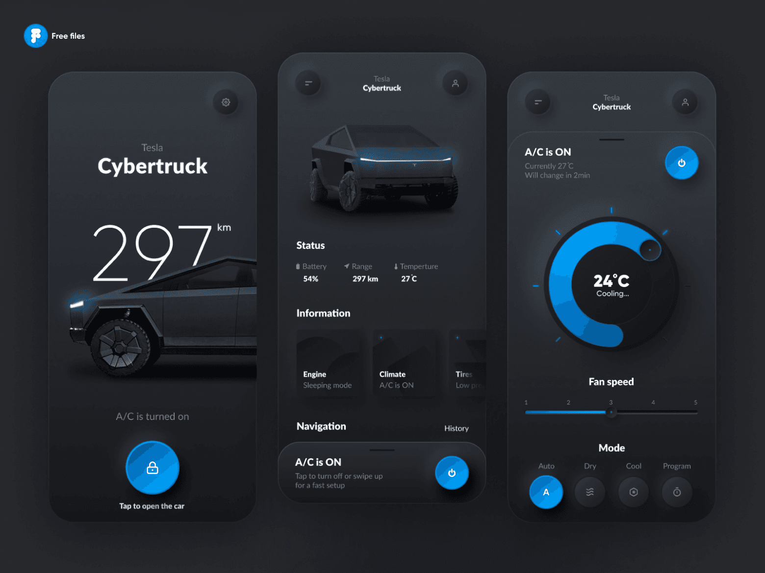
Futuristic automotive companion interface featuring extruded soft-UI status panels and vehicle controls.
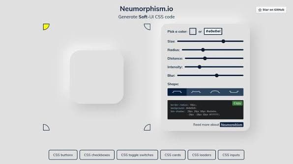
Web application that democratized dual box-shadow CSS code generation for developers worldwide.
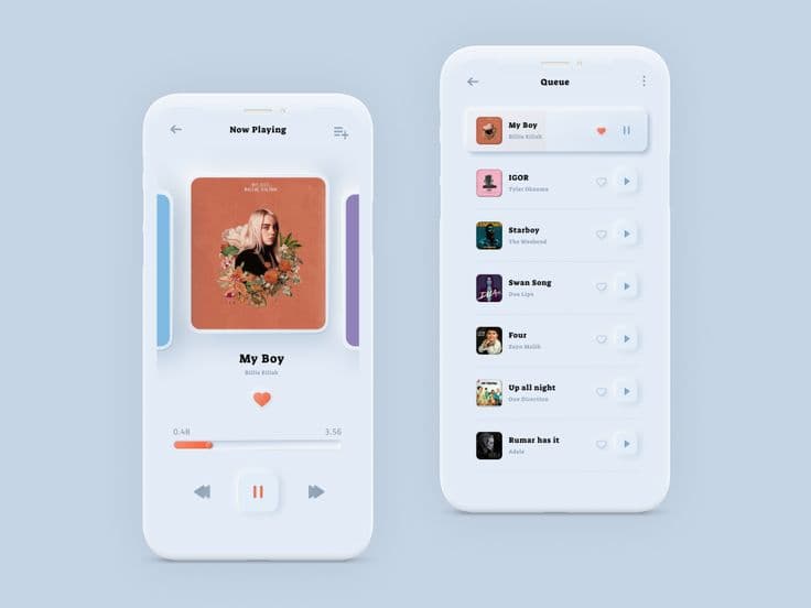
Inset album artwork frames, tactile rotary volume dials, and depressed play buttons.
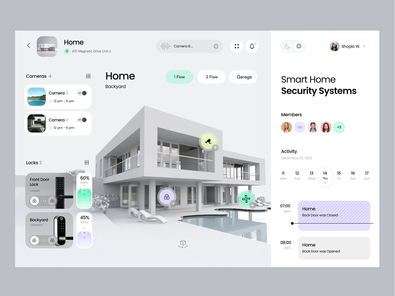
Extruded tactile toggle switches mimicking physical wall-mounted home automation hardware.
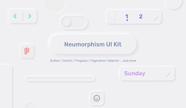
Standardized soft-UI components, shadows, and color systems for Figma UI designers.
Neumorphism (or “soft UI”) emerged around 2019–2020 as designers sought an alternative to flat homogeneity and Material's rigid card patterns. Popularized by Dribbble concepts and Figma tutorials, it used dual box-shadows — one dark, one light — on monochromatic backgrounds to create pillowy, extruded elements. The trend coincided with design tool maturity, CSS box-shadow capabilities, and a hunger for visual novelty during the early pandemic design community boom.
Alexander Plyuto sparks Neumorphism on Dribbble
Designer Alexander Plyuto posts a viral mobile banking concept blending skeuomorphism and flat UI, giving birth to Neumorphism.
Peak neumorphism popularity
Tutorials, Figma kits, and CSS generators make the style widely accessible.
Accessibility criticism mounts
Low contrast ratios and unclear affordance spark industry pushback.
Trend fades from mainstream
Glassmorphism and bento UI replace neumorphism as the dominant exploration trend.
Dribbble
platformPrimary venue where neumorphism concepts gained viral visibility.
Figma Community
platformFree neumorphic UI kits accelerated adoption among designers.
Neumorphism.io
productCSS generator tool created by Adam Giebl that let developers quickly create soft UI components.
Apple
companyApple adopted subtle soft-shadow depth and extruded elements in macOS Big Sur (2020) app icons, directly borrowing from the viral Neumorphism trend.
Alexander Plyuto's Mobile Banking Concept
2019The single viral design shot from 2019 that launched the entire Soft UI movement.
Neumorphism.io CSS Generator
2020Created by Adam Giebl, democratizing dual-shadow CSS (box-shadow: 5px 5px 10px #b8b9be, -5px -5px 10px #ffffff) for web developers worldwide.
Smart Home & Audio Player UI Controls
2020The niche domain where soft extruded buttons saw actual adoption in IoT and media dashboard widgets.
It looked fresh and tactile in portfolio shots. Design tools made it easy to replicate. It offered a middle ground between flat sterility and skeuomorphic excess. Social media design communities reward visually distinctive concepts, and neumorphism photographed well in mockups.
Severe accessibility failures — WCAG 2.1 AA/AAA contrast minimums were routinely violated due to the low-contrast monochromatic backgrounds and reliance on faint shadow boundaries. Users could not reliably distinguish interactive from static elements, and button click/active affordances were nearly invisible for visually impaired users. It performed poorly in dark mode and failed usability testing in production. Critics rightly labeled it “design for Dribbble, not for real users.”
Glassmorphism and AI-era bento UI, which offered visual novelty with better contrast options and more flexible dark mode support.
Neumorphism reminded the industry that visual trends must be rigorously tested against WCAG contrast and accessibility standards before adoption. It influenced subtle soft shadows in modern design systems, and its dual-shadow syntax remains a staple in specialized dashboard widgets and IoT interfaces.