Software2004 – 2013
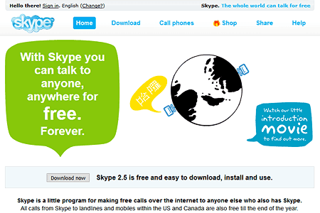
Skype Desktop Client
Sky-blue gradients and friendly rounded UI for global voice calls.
Glossy gradients, reflections, and the social web · 2005 – 2010
A visually exuberant era defined by glossy buttons, pill shapes, reflections, badges, and user-generated content platforms that reshaped the internet.
2005 – 2010
Share & Subscribe
After the dot-com bust, the web reinvented itself around participation. Rounded corners, gel buttons, gradients, and drop shadows signaled approachability. Flickr, Digg, and Skype proved that software could feel friendly — even fun.
Orange vote buttons and social news cards — digg a story to bump the counter.
Soft gradients and status dots that made VoIP feel human.
Pink accents on powder-blue — UGC as product design.
Gmail, Flickr, and startups wore a permanent Beta ribbon for years.
Glossy icons through 2013 — before the iOS 7 flat redesign.
Photoshop tutorials that taught a generation glossy UI craft.
The social web's glossy era — rounded corners, reflections, and community-driven interfaces that invited participation.
Sky-blue gradients and friendly rounded UI for global voice calls.
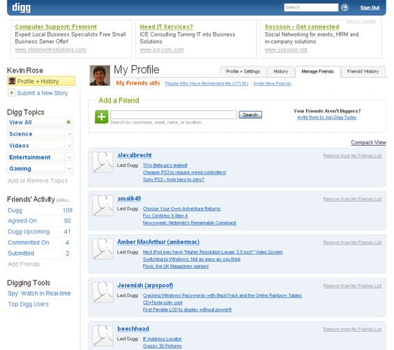
Orange gradients and upvote-driven news — the definitive Web 2.0 layout.
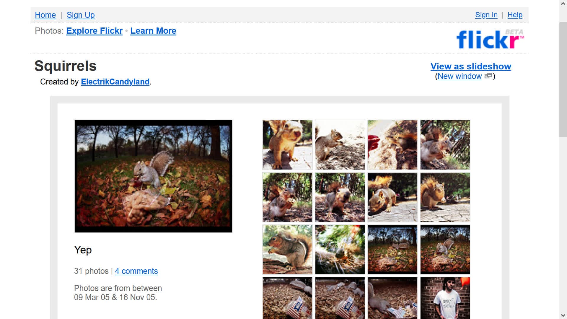
Pink-and-blue identity with tag clouds and community photo sharing.
Corner ribbons and glossy green badges that declared products permanently in beta.
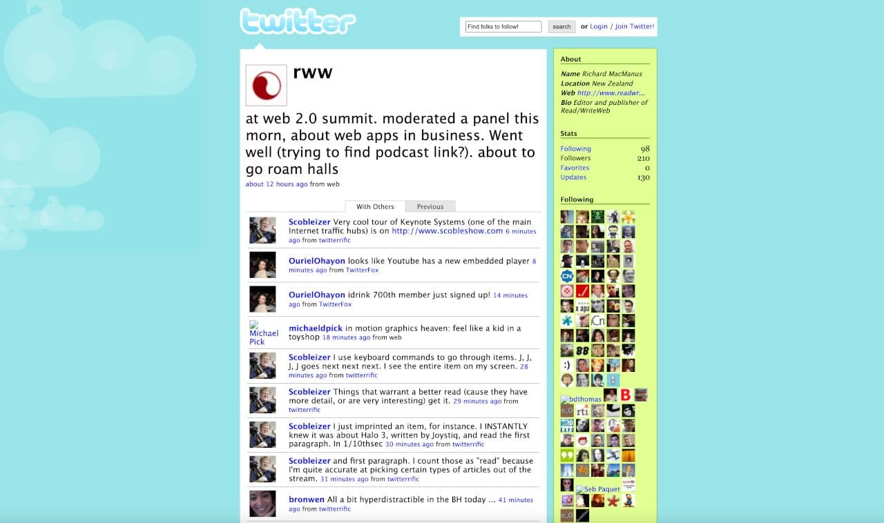
Minimal rounded microblogging with a sky-blue bird identity.
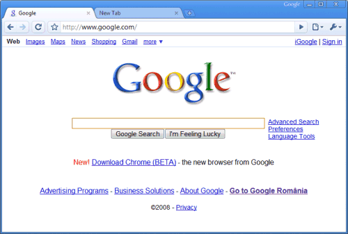
Original glossy trapezoidal tabs and minimal chrome — before Material Design flattening.
Photoshop-layered glossy buttons — the peak era of gel-button tutorials.
“Web 2.0” described a shift from static pages to participatory platforms — blogs, wikis, social networks, and tagging systems. Visually, this coincided with CSS maturation and a distinctive aesthetic: glossy gradients, rounded corners, reflections, and oversized friendly typography. Companies like Google, Flickr, and Digg popularized clean but playful interfaces that signaled approachability. The glossy look communicated innovation and optimism during a period of rapid internet growth after the dot-com crash recovery.
Self-publishing platforms democratize content creation beyond personal homepages.
Social and photo-sharing platforms define the participatory web with friendly, rounded UI.
Gmail and Google Maps demonstrate rich interactions without full page reloads.
Voting, badges, and gradient-heavy designs become synonymous with Web 2.0.
Mobile begins challenging glossy web aesthetics with touch-first, simplified interfaces.
After the dot-com crash, the web needed to feel optimistic again. Glossy design signaled modernity and friendliness. Ajax made interfaces feel app-like. Social platforms needed approachable UI to onboard non-technical users. CSS finally enabled these effects without Flash.
Mobile screens demanded simpler, faster interfaces. Glossy effects were hard to scale across devices. Users matured and began preferring content over chrome. Apple's iOS 7 flat redesign and responsive design principles made glossy ornamentation feel dated and performance-heavy.
Web 2.0 Glossy was directly succeeded on the web by Flat Design (2012–2014), then modern editorial Minimalism (2015–Present), and responsive mobile-first UI as glossy ornamentation gave way to speed and clarity. Frutiger Aero was a contemporary parallel aesthetic—focused on OS shells, hardware surfaces, and 3D glass—not a direct successor to glossy social-web interfaces.
Web 2.0 established user participation as a design requirement — comments, sharing, voting, and profiles became standard. The era's social patterns live on in every modern platform. Glossy gradients occasionally resurface in nostalgia-driven design and startup landing pages.