2012 – 2017 · Flat Design
Content over chrome
Zero ornament. Solid colour.
Bold color, zero ornamentation, content-first
A radical simplification of digital interfaces that removed shadows, gradients, and textures in favor of bold color, typography, and clarity.
Swiss roots · 40%
Clarity through reduction
01
No gradients, shadows, or textures
02
Bold, flat color blocks
03
Simple geometric icons
04
Typography as primary visual element
05
Grid-based, content-first layouts
06
Minimal chrome and ornamentation
Interactive comparison
Skeuomorphism vs. Flat
Drag the divider. Left: faux materials, bevels, and inset shadows. Right: white plane, bold type, zero depth — the visual contract Flat Design made with users.
After · Flat
Solid fill · No shadow · Readable contrast
Before · Skeuomorphic
Leather grain · Bevel · Inset highlight
Case study · 20%
The iOS 7 Revolution
In 2013 Apple abandoned leather, linen, and skeuomorphic chrome for Helvetica Neue Ultralight, hairline icons, and borderless text buttons. Overnight, Flat Design left design blogs and entered every pocket on Earth.
Translucency and motion remained — but ornament did not. That trade-off is what made Flat Design feel inevitable to mainstream users.
Settings
Flat by default
Line-art icons. No gradients. System blue for actions.
- Messages
- Camera
- Weather
- Settings
Case study · 20%
Microsoft Metro UI & The Tile Logic
Windows 8 made Flat Design a platform language: live tiles, solid colour blocks, and zero ornament. Here the Metro Start Screen sits inside a constrained Wet Asphalt stage — a specimen, not the whole gallery.
Start
Interactive tile grid
Tap a tile — Metro's only motion affordance is a quick press scale, never a shadow or bounce.
- Content over chrome — tile labels sit in the corner
- Solid colour blocks — no gradients, no bevels
- Strict grid — asymmetric spans still snap to columns
Reference · 20%
Flat UI Color Palette
Designmodo's 2013 Flat UI Colors set became the unofficial kit of parts for a generation of Bootstrap themes and landing pages. Hover or select a swatch to reveal its HEX and tint this gallery wall.
Select a swatch to inspect its HEX code.
Design Museum
Representative interfaces, products, and artifacts from this era
The great simplification — bold color, crisp typography, and interfaces stripped of ornament in service of clarity and speed.
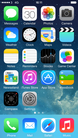
iOS 7
Apple's dramatic flat redesign that legitimized the movement industry-wide.
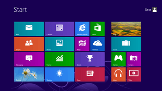
Windows 8 Metro
Bold tiles, flat typography, and a touch-first grid layout.

Instagram (2016 Rebrand)
May 2016 minimalist black-and-white UI redesign paired with a vibrant flat gradient logo that defined mid-2010s app design.
Airbnb Belo
Custom typeface and flat coral identity system.
Google Product Icons (2013)
Unified flat icon grid across Gmail, Drive, and Maps.
Medium Editor
Typography-first publishing with zero chrome distraction.
Historical Background
Flat design was a deliberate reaction against skeuomorphism and glossy excess. As smartphones became the primary internet device, interfaces needed to be fast, legible, and scalable. Microsoft's Metro UI (2010), then Apple's iOS 7 (2013), demonstrated that users no longer needed physical metaphors. Designers embraced grids, bold color blocks, simple icons, and typography as the primary visual tools. The movement aligned with responsive design, performance optimization, and a cultural shift toward minimalism.
Timeline
2010
Windows Phone Metro UI
Microsoft introduces typography-driven, tile-based flat design to mobile.
2013
iOS 7 flat redesign
Apple strips skeuomorphism, shocking users but mainstreaming flat design globally.
2014
Material Design announced
Google introduces a systematic design language that adds depth back to flat principles.
2015
Responsive design becomes standard
Flat, grid-based layouts prove ideal for multi-device scaling.
2016
2016–2018: Emergence of Flat 2.0
Designers reintroduce subtle drop shadows, color gradients, and micro-interactions to fix usability issues without sacrificing flat minimalism. (Neumorphism later emerged in late 2019/2020).
Major Companies & Products
Apple iOS 7
ProductThe cultural tipping point that made flat design the global default overnight.
Microsoft Metro/Fluent
ProductTypography-first, tile-based design system for Windows and Windows Phone.
Medium
PlatformContent-first publishing with minimal chrome and typography-driven layout.
Bootstrap 3
ProductPopular CSS framework that standardized flat, responsive components across the web.
Key Visual Characteristics
- No gradients, shadows, or textures
- Bold, flat color blocks
- Simple geometric icons
- Typography as primary visual element
- Grid-based, content-first layouts
- Minimal chrome and ornamentation
Why It Became Popular
Mobile screens demanded clarity and speed. Users had become digitally literate. Flat design was cheaper to implement, faster to load, and easier to maintain across screen sizes. Apple's endorsement made it the safe corporate choice. It also aligned with modernist design principles valued in tech culture.
Why It Declined
Critics called it “boring” and homogeneous — every app looked the same. Usability suffered when flat buttons lacked visual affordance. Material Design reintroduced depth. Trends like neumorphism and glassmorphism sought visual variety. Flat evolved rather than died — it became the baseline, not the differentiator.
What Replaced It
Flat design was not abolished; it evolved. Google's Material Design added systematic depth, tactile card metaphors, and z-index elevation to flat principles, resolving usability issues while keeping interface chrome clean.
Legacy & Long-Term Impact
Flat design established the modern baseline for UI: clean, fast, content-first. Icon fonts, SVG icons, and design systems became industry standard. The era proved that design trends are cyclical reactions — flat was the pendulum swing away from skeuomorphism, not a permanent end state.
Famous Examples
iOS 7 (2013)
2013
Jony Ive's controversial redesign that deleted textures, shadows, and realism.
Windows 8 Start Screen
2012
Bold colored tiles replacing the traditional Windows desktop metaphor.
Instagram (2016 redesign)
2016
May 2016 redesign that dropped the iconic brown leather camera icon in favor of a black-and-white flat UI and vibrant gradient logo.
Interesting Facts
- iOS 7's redesign caused genuine user distress — some reported feeling “sea sick” from animations.
- “Flat design” and “minimalism” are related but not identical — flat is specifically anti-skeuomorph.
- Many flat icons failed accessibility tests due to insufficient contrast and affordance.
- Flat design made it easier to implement dark mode years later.