
Software2022 – Present
Joon — Claymorphic Wellness App UI
Chunky pastel cards and moulded controls used to lower the stakes of a first run.
2021 – 2024
Inflated, toy-like objects with soft volumetric depth
A soft-3D interface style in which controls look like moulded clay or plastic toys — heavily rounded, inflated forms with a large drop shadow beneath and a bright rim of light along the top edge.
Take the inflation to zero. The corner radius does not change — and what is left is a rounded rectangle, not clay. The volume is entirely in the three shadows.
Moulded: lifted, lit from above, dark underneath.
box-shadow:
  0 18px 32px -12px rgba(102, 72, 214, 0.50),   /* lift */
  inset 0 10px 18px -8px rgba(255, 255, 255, 0.95),   /* top rim */
inset 0 -12px 18px -10px rgba(102, 72, 214, 0.45); /* underside */This is the correction that named the style. Neumorphism failed on contrast and affordance precisely because it insisted the object be made of the page.
Live soft-3D interfaces — inflated, heavily rounded controls and illustration that sit above the page instead of being extruded out of it.
Chunky pastel cards and moulded controls used to lower the stakes of a first run.

Rounded mascots and inflated UI chips that feel moulded, not drawn flat.

Tutorial-grade clay surfaces teaching the inflated-object grammar to product teams.
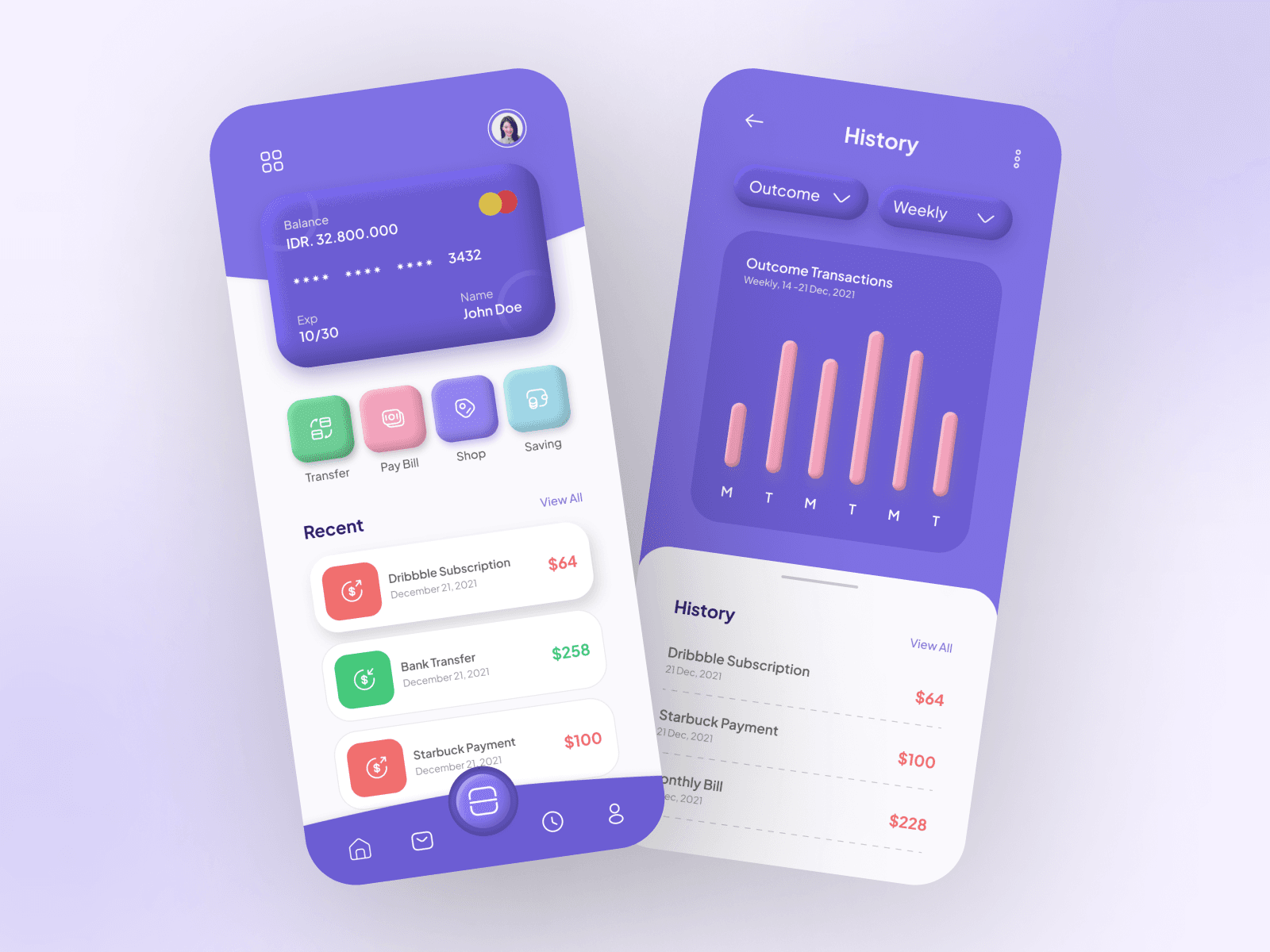
Finance chrome cast as soft clay slabs — cards, dials and balances with moulded edges.
Claymorphism was named and described by Michał Malewicz of Hype4 Academy in 2021, as a proposed successor to the neumorphism experiments that had failed on contrast and affordance a year earlier. The diagnosis was specific: neumorphism made objects out of the same material as the page, so nothing could be seen and nothing looked pressable. Claymorphism kept the softness and gave the objects back their own fill, their own elevation and their own edges. The timing mattered as much as the argument. Browser-based and increasingly approachable 3D tooling put soft-lit, rounded-form illustration within reach of interface designers who were not 3D artists, and the same rounded-square, soft-light language had already been normalised by contemporary desktop and mobile icon grids. The result spread fastest through onboarding flows, consumer finance, education and childrens products — places where an interface benefits from looking approachable and where data density is low.
Rounded-square icons with soft internal lighting and gentle volume are adopted at operating-system scale, normalising the form language claymorphism would build on.
Michał Malewicz of Hype4 Academy publishes the description of claymorphism, framing it explicitly as a correction to neumorphism’s contrast and affordance failures.
Browser-based 3D editors and design-tool plugins let interface designers produce soft-lit rounded objects without a traditional 3D pipeline, and rounded 3D icon packs proliferate.
Fintech, edtech and childrens apps use inflated buttons, chunky toggles and pastel cards to make first-run flows feel friendly and low-stakes.
Attention shifts to flatter, denser, text-forward AI product interfaces, and the heavy shadow stacks prove awkward to maintain across dark mode and data-heavy screens.
Where Michał Malewicz named and documented claymorphism, including the specific shadow recipe that defined it.
Tools that made soft-lit, rounded 3D objects producible and embeddable by interface designers, which is what let the style exist beyond flat mockups.
Its rounded-square icon grid with soft internal lighting normalised the underlying form language at operating-system scale.
Circulated the concept shots, 3D icon packs and component studies through which the style was learned and copied.
It read as friendly without reading as childish, which suited onboarding, education and consumer finance. Technically it was easy: the whole effect is a border-radius plus a drop shadow and two inset shadows, so it could be applied with CSS alone and matched by an illustrator in 3D. And unlike the neumorphism it was answering, it did not force designers to choose between the look and legible contrast, because the object and the background were allowed to be different colours.
The shadow stack is expensive to maintain. Each surface needs an outer shadow and two inner ones retuned for every background and every colour mode, and dark mode in particular inverts the assumption that light comes from above a pale field. The heavily rounded, oversized controls also waste space, so the style never scaled to dense tables, dashboards or long forms. As product attention moved to AI interfaces built around text and density, the soft toy language stopped fitting the work.
Flatter, denser modular layouts — the bento and AI-product direction — along with atmospheric gradient backgrounds that provide visual interest without putting depth into every individual control.
Claymorphism is the practical answer to what neumorphism got wrong, and it is worth studying for that reason alone: keep the softness, restore the contrast, let the object be made of something other than the page. Its rounded, soft-lit object language persists in 3D illustration, in app icon design, and in the friendly empty states and onboarding art of consumer products.
Michał Malewicz’s 2021 description of the style, which specified the drop-shadow-plus-two-inset-shadows recipe that everything else copied.
The soft-lit, heavily rounded object sets that carried the look into products whose teams had no 3D capability of their own.
Fintech and education first-run screens where inflated buttons and pastel cards were used to lower the perceived stakes of signing up.
It was designed as an argument: the style was proposed specifically to fix neumorphism, not discovered independently of it.
The whole effect is three shadows — one outside for elevation, one inset at the top for the light rim, one inset at the bottom for the underside.
Neumorphism and claymorphism look related but are structural opposites: one insists the object is the same material as the page, the other insists it is not.
The style is almost never used for data tables, because the corner radii and padding it depends on consume the space a table needs.