Website2021 – Present
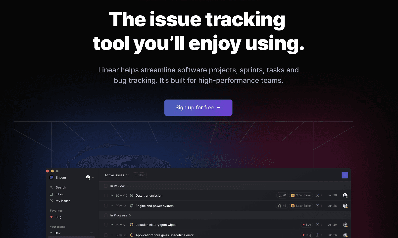
Linear — Dark Mode Ambient Glow
Near-black product chrome lit by restrained coloured glows under large type.
2021 – Present
Luminous colour fields as the interface environment
A modern style in which large, slowly shifting mesh gradients form the environment a product sits inside — atmospheric light rather than decorated background, with typography and thin surfaces carrying the hierarchy.
No shader and no images. Move the layers around and watch what happens to the heading — the field is the easy part.
Light, not wallpaper
background:
  radial-gradient(ellipse 62% 48% at 14% 8%, rgba(56, 189, 248, 0.42), transparent 62%),
  radial-gradient(ellipse 58% 44% at 82% 30%, rgba(167, 139, 250, 0.46), transparent 60%),
  radial-gradient(ellipse 70% 52% at 50% 96%, rgba(45, 212, 191, 0.34), transparent 62%),
  #070b14;
Live product sites that treat the background as an environment with its own light — quiet interface chrome floating over luminous mesh fields.
Near-black product chrome lit by restrained coloured glows under large type.

A continuously morphing shader mesh that set the technical high-water mark for the style.
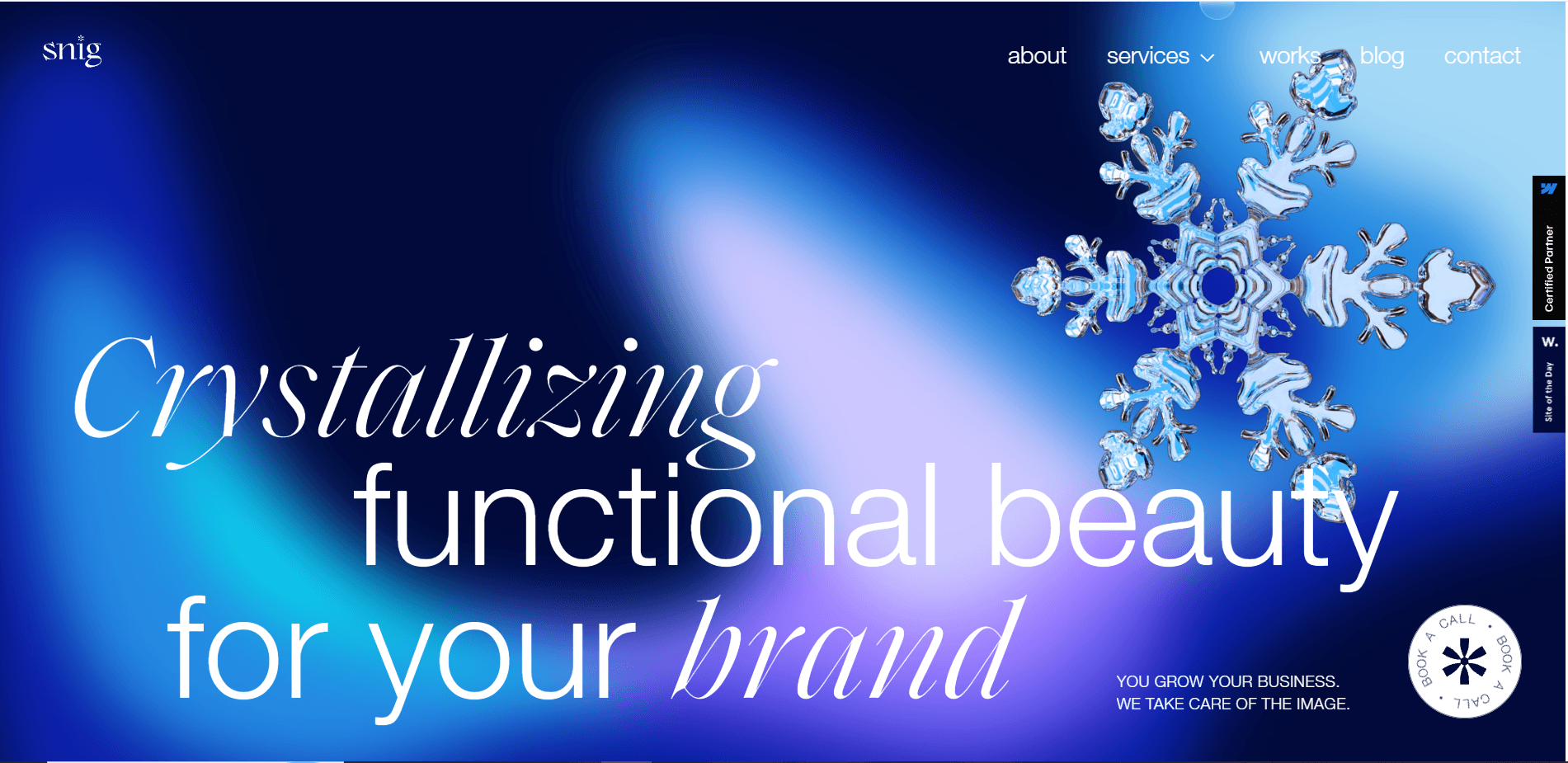
Refractive 3D glass objects staged inside a soft navy–cyan–lavender aurora field.
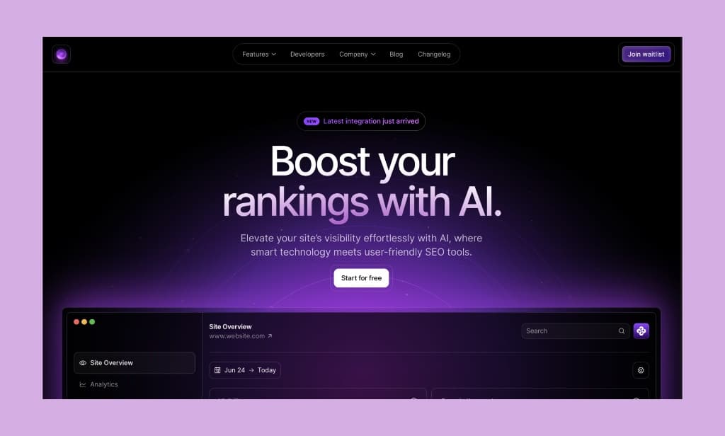
Launch chrome bathed in saturated purple aurora light and soft bloom.
Around the turn of the 2020s the marketing web converged on a single move: replace the flat hero colour with an enormous, soft, multi-point gradient that behaves like light in a room. The technique had two independent sources. One was hardware-accelerated rendering — animated gradient meshes drawn in WebGL, most famously on Stripe’s site, which was studied and reimplemented across the industry. The other was plain CSS, where several oversized radial gradients layered over a dark neutral produce a convincing aurora with no JavaScript at all. Developer-tool and infrastructure companies, Linear among the most imitated, pushed the dark variant into a recognisable house style from 2021 onward, and operating-system wallpapers moving in the same direction made the language feel native rather than decorative. What separates it from glassmorphism, which it is often confused with, is where the subject sits: glassmorphism puts frosted panes in front of a gradient and makes the blur the subject, while here the light field is the subject and the surfaces stay thin, quiet and largely unblurred.
Hardware-accelerated, slowly morphing gradient meshes appear on high-profile product sites and are widely studied and reimplemented.
Infrastructure and developer-product companies adopt a dark neutral foundation lit by a few large coloured glows, and the pattern spreads across the category.
Design-tool plugins and standalone generators output ready-made mesh gradients as images or CSS, putting the style within reach of teams with no shader experience.
Luminous gradient fields become the conventional backdrop for AI product pages, to the point that the look starts to read as a category signal rather than a brand one.
With the technique everywhere, the distinguishing work moves to motion discipline, typographic hierarchy and contrast management rather than to the gradient itself.
Its animated WebGL gradient is the most-studied implementation of the technique and the reference point most later work was measured against.
Popularised the dark-foundation variant — a near-black field lit by a few restrained coloured glows — which became the default look for developer-facing products.
Plugins and web tools that produce mesh gradients as exportable images or CSS, which is what turned the style from a shader project into a design decision.
Operating-system wallpapers built from large soft colour fields normalised the aesthetic as an environment rather than an ornament.
It gives a page atmosphere and a sense of depth without adding a single component, which is unusually cheap: a handful of layered radial gradients over a dark neutral costs nothing to render and needs no assets. It photographs and screenshots well, it reads as contemporary and technical, and because the colour is diffuse rather than applied to elements, it can sit behind an otherwise conservative, accessible interface without interfering with it.
It has not declined so much as saturated. Once every AI and infrastructure launch shared the same luminous field, the style stopped signalling anything about a particular product. It also carries real costs when handled badly: large blurred layers are expensive to composite and animate, text placed over a moving field can drift below usable contrast as the colours shift, and continuous ambient motion has to be stoppable for people who ask for reduced motion.
Nothing yet. The gradient field has largely become infrastructure — an expected backdrop — with differentiation moving to typography, layout structure and motion restraint on top of it.
Aurora work re-established atmosphere as a legitimate layer of interface design, separate from both ornament and component styling, and it did so mostly in plain CSS. Its lasting contribution is the practice of treating the background as an environment with its own light, colour and slow time, while the interface above it stays quiet.
Shader-driven meshes that morph continuously behind an otherwise restrained marketing page — the technical high-water mark of the style.
A near-black foundation lit by two or three large coloured glows, set under large type — the most imitated arrangement of the 2020s.
Large soft colour fields shipped as system wallpapers, which made the language feel native to the platform rather than to the web.
The convincing version is usually plain CSS: three or four oversized radial gradients layered over a dark colour, with no shader and no images.
Glassmorphism and aurora are frequently confused, but they invert each other — one makes the panel the subject and the gradient the wallpaper, the other makes the light field the subject and keeps panels nearly invisible.
The hardest part is not the gradient but the text: as the field shifts, contrast under a heading changes, so the type has to survive the worst moment of the animation rather than the screenshot.
Ambient motion here is measured in tens of seconds per cycle; anything fast enough to notice reads as a loading state instead of an environment.