Human figures with elongated, boneless limbs and simplified heads
2017 – 2023
Corporate Memphis
Flat friendly figures explaining software to you
The illustration and communication language of late-2010s technology marketing — weightless human figures with elongated limbs and non-literal skin colours, drawn flat in a small palette, used to make software feel approachable on a hero, a feature row and an onboarding screen.
Key Visual Characteristics
Non-literal skin colours drawn from the brand palette
Flat vector shapes with no gradient, texture or cast shadow
- Oversized props and abstract geometric scenery
- A small palette of muted pastels plus one saturated accent
- Friendly geometric sans-serif set large and loosely
- Hero, feature row, onboarding scene and testimonial as fixed page rhythm
Timeline
2017
Alegria establishes the pattern
Facebook develops an illustration system with the studio Buck built on simplified human figures with exaggerated limbs in a flat geometric world, and applies it across its products and marketing.
2019
Open illustration kits make it universal
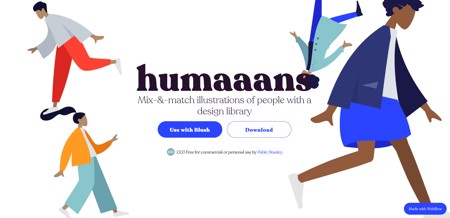
Free, mixable character libraries — Humaaans and Open Peeps among the best known — let any team ship the same figures without commissioning original artwork.
2020–2021
Peak adoption across technology marketing
The hero illustration, the three-column feature row and the onboarding scene become the default structure of a software marketing page, from large platforms to seed-stage startups.
2021
The name and the backlash arrive together
Criticism converges on sameness and evasion: every site looks identical, and weightless friendly figures are being used to describe products with real consequences.
2023
Displacement
Marketing pages move toward photography, product screenshots and 3D, and shortly afterwards toward the text-forward conventions of AI product design.
Build a figure
Figure builder
Three controls, and every combination is still on-style. That lack of variance is the reason the look saturated — and then stopped differentiating anybody.
The default proportions. This is the figure that shipped everywhere.
Representative interfaces, products, and artifacts from this era
Live specimens from the years when technology companies explained themselves with the same friendly, weightless people.

Design Technique2017 – 2018
Facebook Alegria — Buck Illustration System
The originating flat-figure system that flooded SaaS marketing within two years.
Hardware2018 – 2019
Humaaans — Mix-&-Match Corporate Memphis Library
Open character kits that let every team ship the same friendly people.
Website2019 – 2021
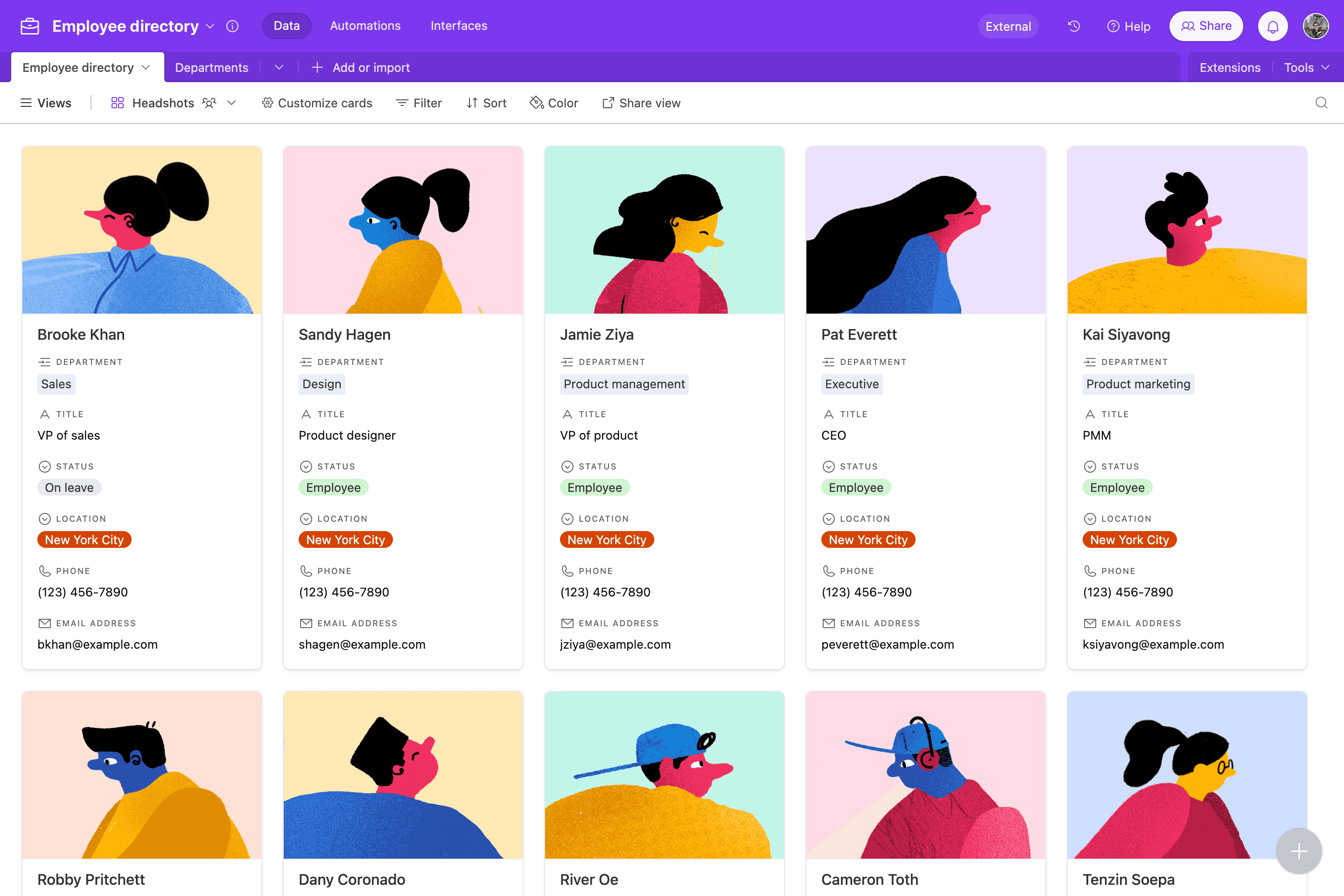
Airtable — Employee Directory & Humaaans System
SaaS product storytelling carried by weightless figures and oversized props.
Website2019 – 2022
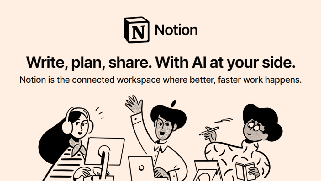
Notion — Monokrom Line-Art Corporate Memphis
A quieter cousin — line-art figures that kept the friendly posture without full Alegria colour.
Historical Background
By the mid-2010s the flat turn had taken ornament out of the interface, and technology companies needed something else to put on a marketing page. Photography was expensive, dated quickly and implied specifics a platform did not want to commit to; screenshots showed a product most visitors could not yet read. Illustration solved all three problems at once, and one system in particular set the pattern: the style Facebook developed with the studio Buck from 2017, known internally as Alegria, put simplified human figures with exaggerated proportions into a flat geometric world. The look spread through the sector almost immediately, helped enormously by open illustration kits — Pablo Stanley’s Humaaans and Open Peeps among them — that let any team assemble the same figures without commissioning a single drawing. The name Corporate Memphis was applied later and somewhat sarcastically, borrowing from the 1980s Milanese Memphis Group whose clashing pastels and geometric shapes the style superficially resembles. What matters for a design museum is that this is not a claim about interface chrome at all. The buttons and cards underneath were ordinary. The style is a claim about how a technology company should talk: warmly, abstractly, and without showing you very much.
Major Companies & Products
BuckCompany
The design and animation studio that developed the Alegria illustration system with Facebook, the work from which the whole category is usually traced.
HumaaansProduct
Pablo Stanley’s open library of mix-and-match figures, which more than any single agency is why thousands of unrelated sites shipped the same people.
Open PeepsProduct
A companion hand-drawn character library from the same author, widely used for the friendlier and less geometric end of the style.
Memphis GroupMovement
The 1980s Milanese design collective whose clashing pastels and geometric forms the name borrows, more for the resemblance than for any direct lineage.
Why It Became Popular
It solved a real problem cheaply. A flat figure with no face commits to nothing — no age, no ethnicity, no specific workplace — so one illustration could serve every market a platform sold into, and it never dated the way a photograph of an office does. It was fast to produce, trivial to recolour into a brand palette, and available off the shelf. It also read as friendly at a moment when technology companies had particular reason to want to.
Why It Declined
The same properties that made it useful made it hollow. Because the figures commit to nothing, the pages stopped communicating anything specific, and visitors learned to scroll past them. Ubiquity destroyed the differentiation that had justified it — when every competitor uses the same character library, illustration is no longer a brand asset. And the gap between weightless cheerfulness and what some of the products actually did became a standing criticism the style could not answer.
What Replaced It
Product screenshots and photography first, then the denser, text-forward layouts of AI-era product marketing, where the interface itself became the thing worth showing.
Legacy & Long-Term Impact
Corporate Memphis is the clearest case in recent memory of a visual language becoming an industry default and then failing because of it, and it is studied for that as much as for the drawings. It also normalised systematic illustration as part of a design system rather than as decoration commissioned per page, and that practice outlived the specific style — teams still maintain illustration libraries, just not of these people.
Famous Examples
The Alegria illustration system2017
The originating work: simplified figures with exaggerated limbs in flat geometric scenes, applied consistently across a platform’s surfaces.
Open character libraries2019
Mix-and-match figure kits that put the same limbs, heads and poses on thousands of unrelated marketing pages.
The standard SaaS marketing page
Hero illustration, three-column feature row, onboarding scene, testimonial, closing call to action — a structure so consistent it became a template.
Interesting Facts
The name was not chosen by anyone who practised the style; it arrived as criticism and stuck.
The figures are usually built from a shared library of interchangeable limbs and heads, which is why unrelated companies shipped recognisably the same people.
Faces are frequently omitted entirely — the less a figure specifies, the more markets one drawing can serve.
It is not Flat Design with pictures: flat design is an argument about interface chrome, this is an argument about how a company should talk.