Active Years: 1998 – 2005
Y2K Aesthetic
Chrome bubbles, iridescent highlights, and millennium optimism
Active Years: 1998 – 2005
Turn-of-the-millennium digital style: metallic gradients, bubble buttons, Matrix greens, Flash intros, and a belief that the future would be shiny.
Macromedia Flash Player 5.0
Initializing Shockwave...
0%
Y2K Aesthetic
1998 – 2005
Wireframe grids, Bondi-blue hardware, and chrome typography — late-90s cyber culture exported a visual language of icy futurism that flooded early-2000s web design.
// Exhibit Manifest
The turn of the millennium fused translucent iMac plastics, Winamp chrome skins, and Bondi-blue hardware into a singular icy aesthetic. Interfaces looked like consumer electronics — outset bezels, inset screens, and hard metallic buttons.
- [+] Brushed chrome bezels & Winamp skins
- [+] Bondi Blue / icy cyan hardware accents
- [+] Inset CRT screens & wireframe 3D globes
Representative interfaces, products, and artifacts from this era
Millennium chrome — Winamp skins, Bondi-blue plastics, and the last moment the web thought it was consumer hardware.
.webp&w=3840&q=75)
Flash Corporate Intro
Skip intro, metallic logo draw-ons, and a 40-second preloader.
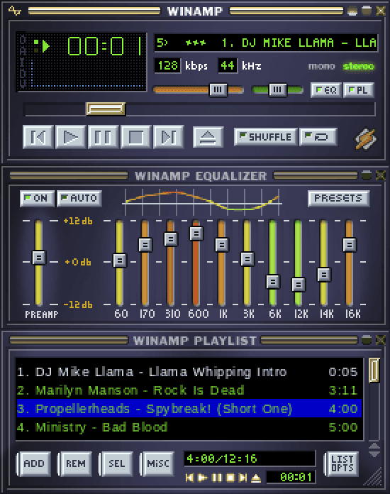
Winamp Classic Skin
Brushed metal, EQ, and a visualizer that ate the CPU.
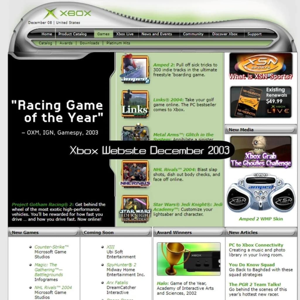
Xbox Cyber Web 2003
Chrome & Gel UI
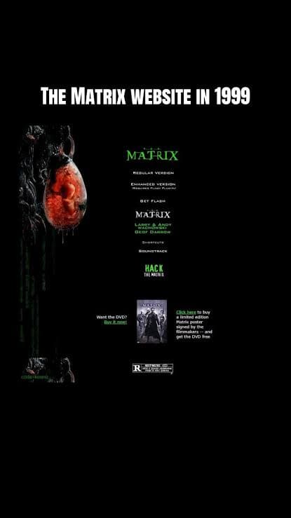
Matrix Fan Terminals
Phosphor green on black as millennium fashion, not just sci-fi.
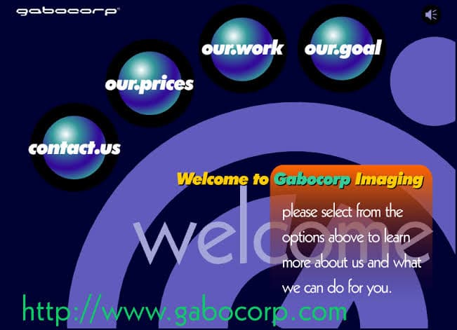
Chrome Orbs / Gabocorp
Spherical, beveled, and always about to roll off the page.
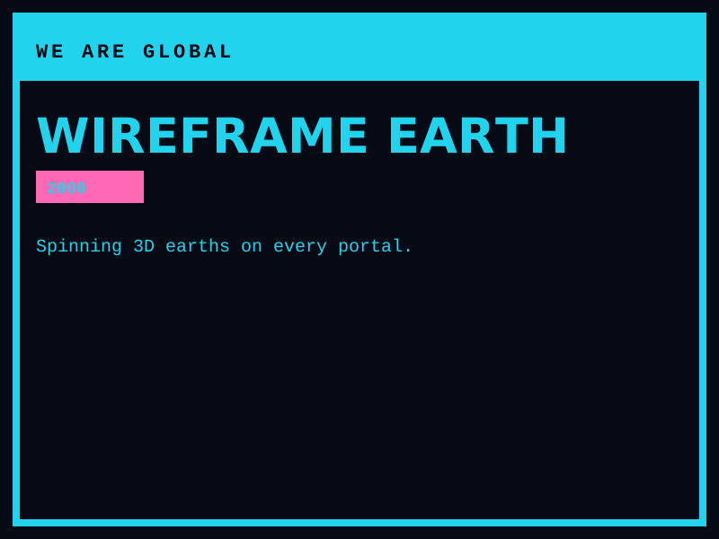
Wireframe Globe Homepages
Spinning 3D earths that meant “we are global now.”
Historical Background
Y2K design sat between skeuomorphic software chrome and the coming Web 2.0 gloss. Consumer electronics, teen magazines, and corporate splash pages used liquid metal, orb buttons, and wireframe globes. The millennium bug, rave culture, and The Matrix gave the look a dual personality: candy-colored optimism and techno-anxiety. Macromedia Flash made motion cheap. After the dot-com crash and the rise of usable Web 2.0, the chrome-orb internet looked dated — until a 2020s revival brought it back as fashion and TikTok nostalgia.
Timeline
[1998]
iMac G3 and translucent candy hardware
Bondi Blue plastics and Bondi-era web palettes leak into site design.
[1999]
The Matrix and millennium marketing
Green terminals, leather, and “the future is digital” campaigns saturate advertising.
[2000]
Flash splash pages become default
Skip intro, preloaders, and metallic orbs dominate corporate homepages.
[2003]
Broadband and blogs begin the hangover
Usability and content-first layouts start to replace intro movies.
Major Companies & Products
Macromedia Flash
ProductThe runtime that made Y2K motion, sound, and chrome buttons possible in the browser.
Apple iMac G3
ProductTranslucent candy hardware that licensed playfulness to the rest of consumer tech.
Winamp
ProductSkinnable chrome players and visualizers as living Y2K desktop sculpture.
Sony / PlayStation 2 era branding
CompanyMetallic type, orbs, and futurist hardware photography.
Key Visual Characteristics
- Chrome, aqua, and iridescent gradients
- Bubble / orb buttons with specular highlights
- Comic Sans, Trebuchet, and inflated display type
- Wireframe globes, stars, and lens flares
- Matrix green on black alongside bubblegum pinks
- Flash preloaders, skip-intro patterns, and looping motion
Why It Became Popular
It looked like the year 2000 was supposed to feel. Consumer electronics, boy bands, and portal sites all wanted to look expensive and futuristic on 800×600 CRTs. Flash let amateurs ship motion.
Why It Declined
Flash was a security and accessibility dead end. Web 2.0 demanded speed, SEO, and real content. Chrome orbs aged into comedy. The 2020s revival treats Y2K as costume, not infrastructure.
What Replaced It
Web 2.0 glossy buttons and then flat design. The revival lives in fashion, album art, and nostalgia landing pages.
Legacy & Long-Term Impact
Y2K locked in the idea that a website could be a show: sound, intro, and chrome. Specular highlights and bubble UI returned in Frutiger Aero and later in glassmorphism. The skip-intro button is a folk monument.
Famous Examples
Flash corporate intros (1999–2002)
2000Metallic logos drawing themselves over a starfield while a progress bar crawled.
Winamp classic skins
1999Brushed metal, EQ, and visualizers as the desktop’s nightclub.
The Matrix (1999)
1999Phosphor green as the color of “inside the machine.”
Interesting Facts
“Skip intro” became so hated it is now a punchline and a collectible UX pattern.
Many Y2K revival looks mix 1999 chrome with 2022 glass — they are not historically identical.
Comic Sans was often chosen because it shipped with Windows, not because it was ironic yet.