NEON-NOIR INTERFACE LANGUAGE
Cyberpunk UI
Neon glow, scanlines, and high-contrast dystopian chrome
A neon-noir interface language drawn from Blade Runner, Japanese night cities, and hacker cinema — cyan, magenta, CRT scanlines, and terminals that feel illegal.
Representative interfaces, products, and artifacts from this era
Neon-noir product chrome — scanlines, HUD labels, and interfaces that pretend they are running on stolen hardware.
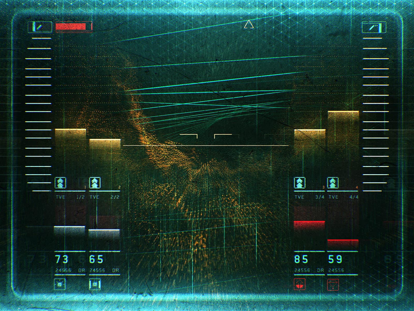
Blade Runner / HUD
Cinematic targeting overlays that taught the web how to look classified.
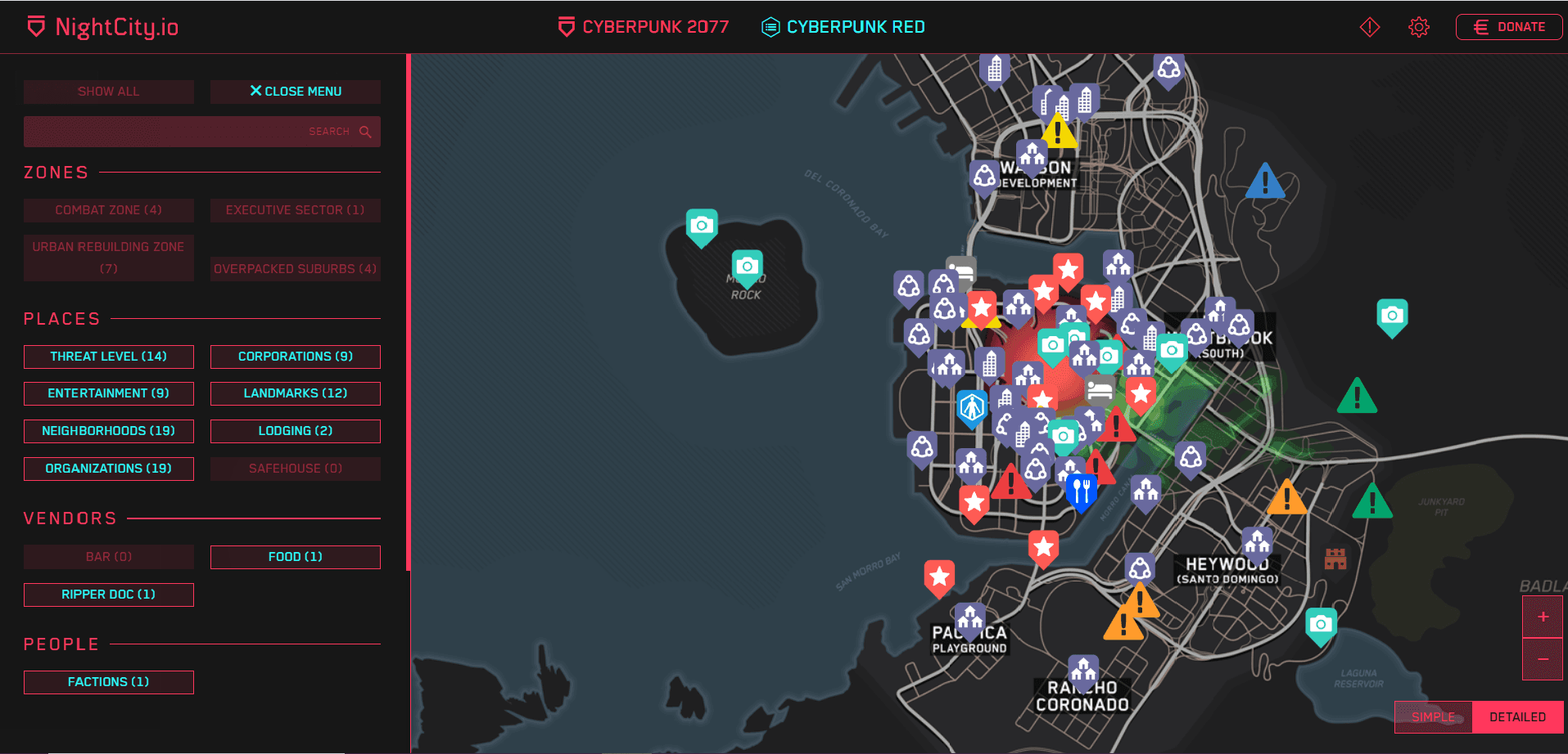
Night City / 2077 Map
Interactive district atlases as neon cartography.
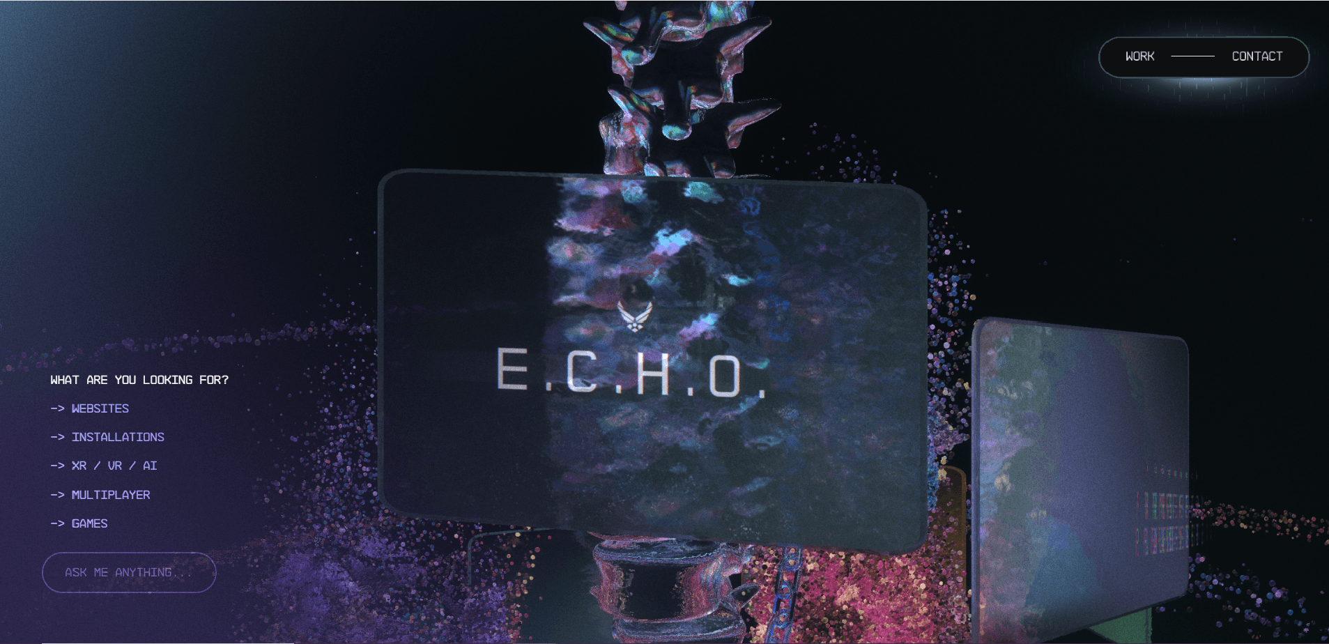
Active Theory / Glitch Type
WebGL experiments where type and UI fracture on contact.
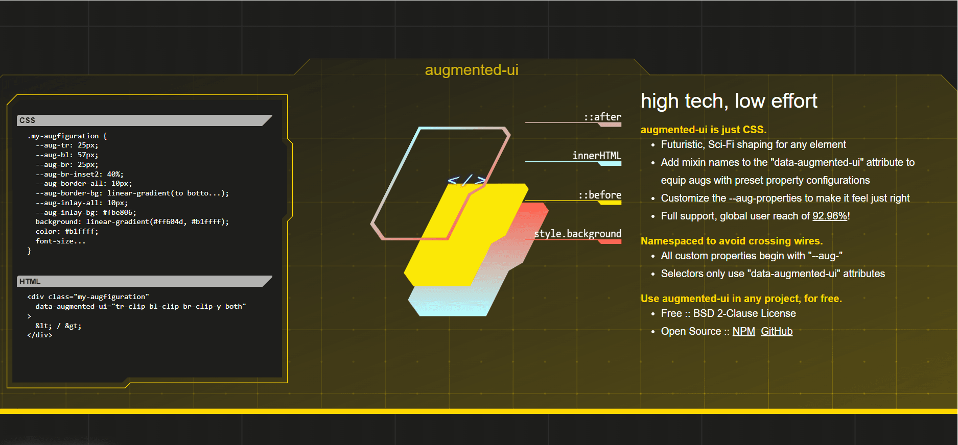
Augmented UI / Cut Corners
Sci-fi panel kits with clipped corners and HUD frames.
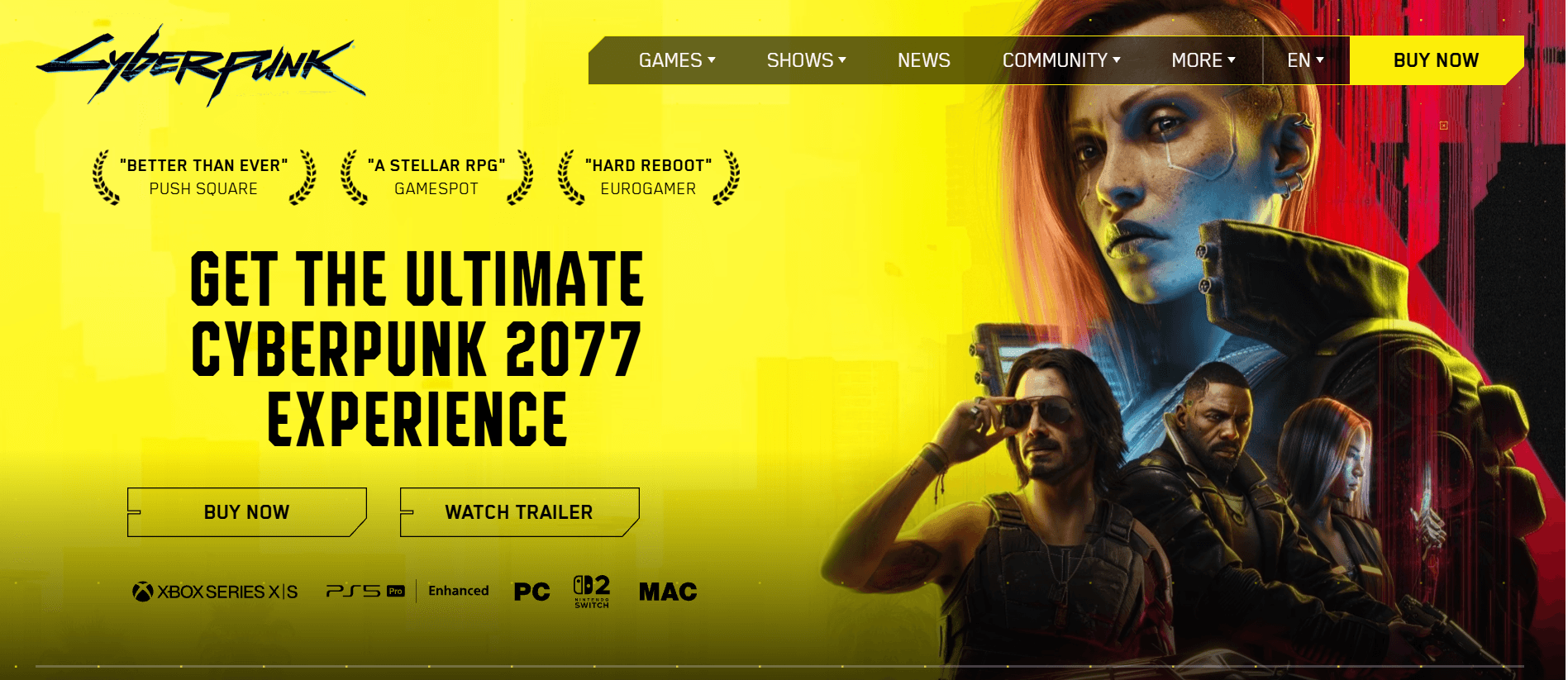
Cyberpunk 2077 / Official UI
Magenta-cyan inventory screens as a complete product skin.
Historical Background
Cyberpunk as a visual system predates the web, but it became a distinct digital-product language in the 2010s. Games such as Deus Ex, the 2017 Blade Runner sequel, and an explosion of synthwave album art taught a generation of designers that interfaces could feel like night markets and mainframes. Web experiments copied CRT curvature, glitch type, and RGB split. Unlike era-default corporate UI, cyberpunk is theatrical: it performs danger, speed, and surveillance. It never fully replaced any mainstream OS, but it became the house style of crypto dashboards, music labels, and sci-fi marketing sites.
Timeline
1982
Blade Runner establishes neon-noir
Ridley Scott’s Los Angeles nightscape becomes the visual bible for cyberpunk interfaces.
1999
The Matrix popularizes terminal green
Digital rain and phosphor green enter mass visual culture.
2013
Synthwave and glitch web aesthetics peak
Tumblr, Dribbble, and CodePen fill with CRT shaders, chromatic aberration, and neon type.
2017
Blade Runner 2049 and HUD fetish
Cinematic HUDs influence dashboard and marketing-site composition.
2020
Cyberpunk 2077 saturates product design
Game marketing and fan sites lock in magenta-cyan UI as a recognizable product skin.
Major Companies & Products
CD Projekt Red
[Company]Cyberpunk 2077 marketing and in-game UI became a reference library for neon product chrome.
Tesla / sci-fi HUD mockups
[Product]Automotive and concept HUDs borrowed cyberpunk contrast, scanlines, and glyph density.
Crypto exchange dashboards
[Platform]Many 2017–2021 trading UIs used neon on black to signal speed and high stakes.
Synthwave music labels
[Movement]Album sites and players popularized CRT overlays, VHS grain, and hot-pink headlines.
Key Visual Characteristics
- Black or near-black grounds with cyan and magenta accents
- CRT scanlines, RGB split, and glitch artifacts
- Monospaced or techno display type (Orbitron, Share Tech Mono)
- Hard neon glows instead of soft drop shadows
- Dense HUD-like labels, brackets, and status glyphs
- High contrast, often at the edge of accessibility
Why It Became Popular
It made the web feel cinematic. Designers tired of flat corporate palettes used cyberpunk to signal underground credibility. The look is instantly recognizable in a screenshot and maps cleanly onto dark backgrounds, shaders, and WebGL.
Why It Declined
Readability and accessibility suffered. Neon-on-black fatigue set in, and many products that adopted the skin looked like costumes rather than tools. Dark mode as a system setting absorbed the useful parts (dark surfaces) without the theatrics.
What Replaced It
System dark mode, calmer dark dashboards, and glassmorphism took the “premium night UI” slot. Cyberpunk survived as a genre skin rather than a default product language.
Legacy & Long-Term Impact
Cyberpunk proved that the web could host fully diegetic, world-built interfaces. Scanline shaders, glitch type, and HUD layouts remain in games, music, and experimental sites. It also pushed dark-surface design into the mainstream years before OS-level dark mode.
Famous Examples
Cyberpunk 2077 (2020)
2020In-game menus and marketing sites defined the magenta-cyan product look.
Mr. Robot title sequences
2015Terminal typography and glitch frames influenced hacker-themed web chrome.
A E S T H E T I C web experiments
2016Vaporwave-adjacent CodePens with CRT curvature and neon grids.
Interesting Facts
True CRT scanlines on LCDs are a nostalgia effect — most users never used a tube monitor.
Cyan/magenta pairing is complementary on RGB displays, which is why it “vibrates” so hard.
Many cyberpunk UIs fail WCAG contrast, which is part of the outlaw fantasy and part of the problem.