ORIGINS // RAW HTML (2014 – 2021)
Brutalist Web Design
Manifesto
A web movement that rejected polish: system fonts, visible grids, hard shadows, and layouts that look unfinished on purpose.
ORIGINS // RAW HTML 2014 – 2021
RAW EXHIBITS
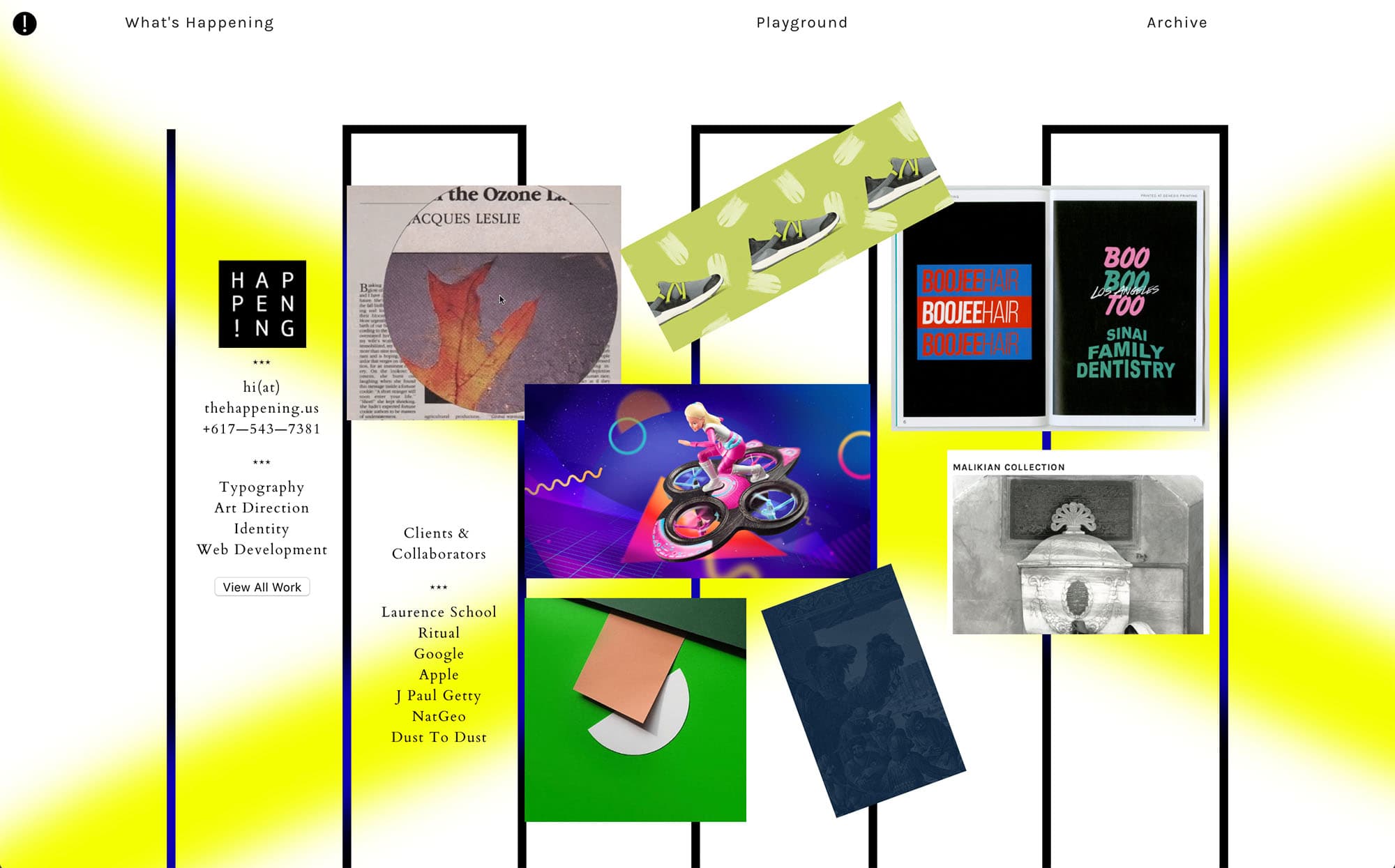
Early web brutalism as stark documents — wireframes, zines, and structural honesty.
DIRECTORY // 2014
BRUTALIST WEBSITES
A catalog of unfinished-looking pages.
- [x] 01 / RAW HTML INDEX
- [x] 02 / SYSTEM FONTS ONLY
- [x] 03 / NO TEMPLATES
- [x] 04 / SUBMIT
PLATFORM // 1995
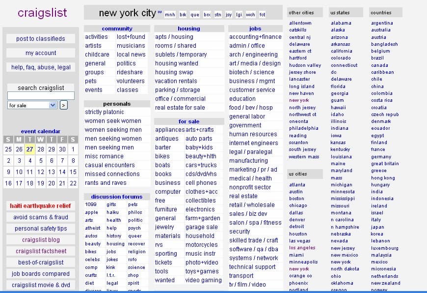
CRAIGSLIST
Accidental brutalism: almost no chrome, infinite staying power.
craigslist: sf bay area
community | housing | jobs | for sale | gigs
COLLECTION // 2016
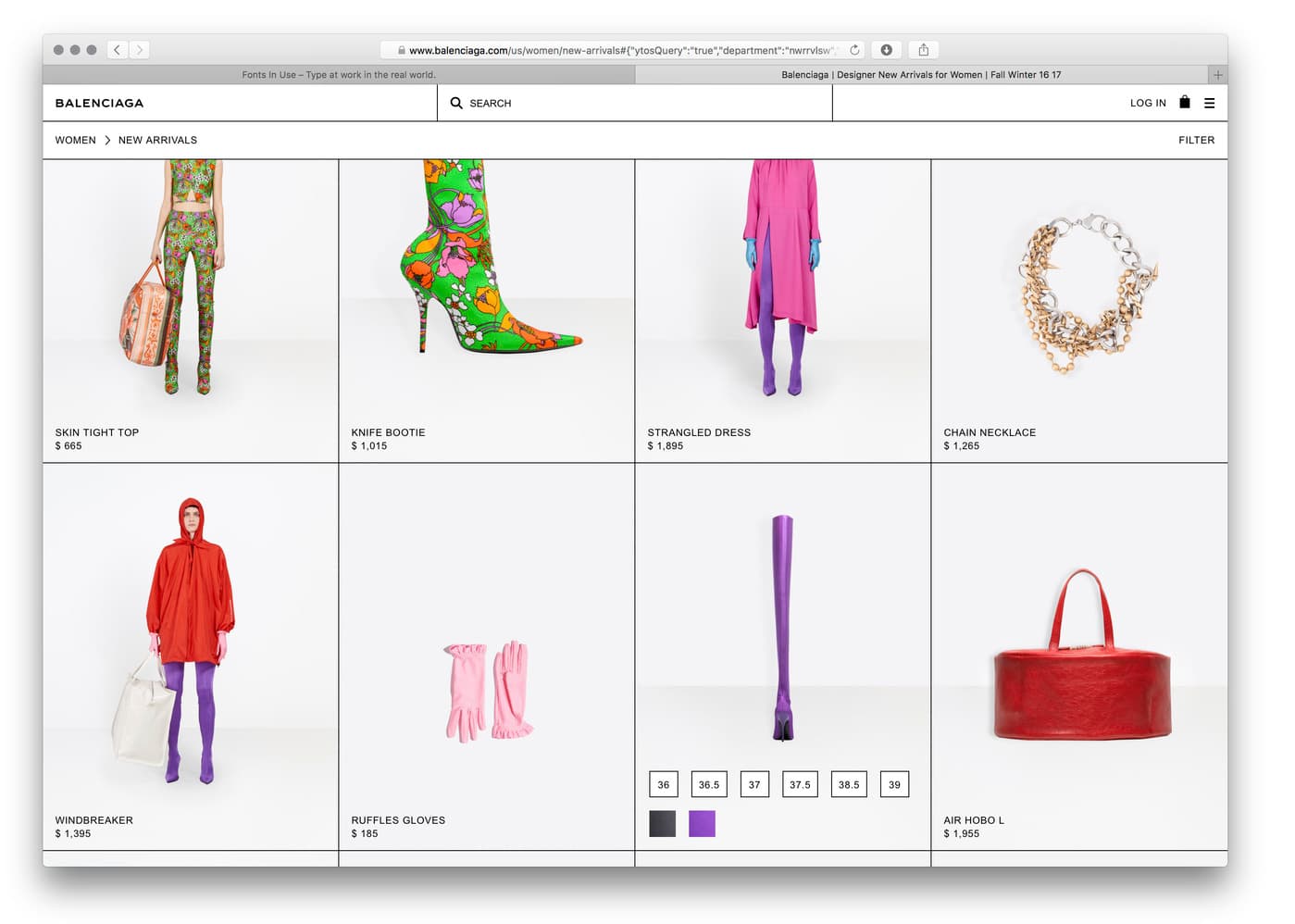
BALENCIAGA.COM (MID-2010S)
Luxury fashion wearing anti-luxury markup.
RAW ANTI-LUXURY HTML
[ ENTER STORE ]EDITORIAL // 2017
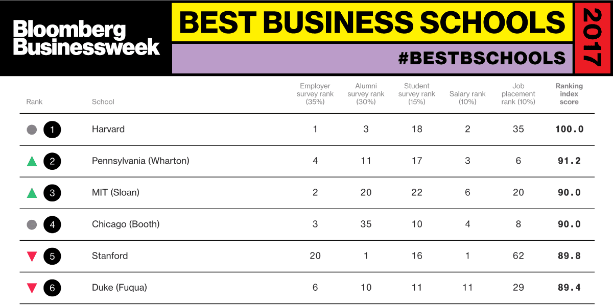
BLOOMBERG BUSINESSWEEK
Editorial modules that collide like print, not like Bootstrap. Dense type, colliding modules, and zero decoration.
Historical Background
Web brutalism borrowed the honesty of concrete architecture — show the structure, hide nothing. Around 2014, designers exhausted by Web 2.0 gloss and early flat sameness published sites that looked like documents, zines, or error pages. Bloomberg Businessweek’s digital experiments, fashion houses such as Balenciaga, and directories like Brutalist Websites catalogued the look. It was a political and aesthetic stance: anti-template, anti-stock, anti-smooth. Neo-brutalism later softened the idea into yellow stickers and offset shadows, but original web brutalism was uglier, louder, and closer to default browser chrome.
Timeline
2014
Brutalist Websites launches
Pascal Deville’s directory gives the unnamed look a name and a canon.
2016
Fashion and editorial adopt raw layouts
Balenciaga and experimental magazines use default type, huge type, and broken grids.
2017
Bloomberg Businessweek digital
High-contrast, system-font editorial design becomes a reference for “ugly on purpose.”
2019
Neo-brutalism commodifies the look
Hard shadows and yellow fills become a Figma starter kit rather than a critique.
2020 – 2022
Web3 & Crypto Adoption
Neo-brutalism becomes the default aesthetic for Web3 projects, crypto exchanges, and NFT marketplaces. Thick borders, bright contrasting colors, and hard shadows are utilized to signal ‘disruption’ and ‘decentralization’, ultimately cementing the once-rebellious style as a commercial, mainstream UI template.
Major Companies & Products
Brutalist Websites
PlatformThe catalog that defined which sites counted as brutalist.
Balenciaga.com (mid-2010s)
PlatformLuxury fashion using raw, anti-luxury web layouts as branding.
Bloomberg Businessweek
ProductEditorial brutalism: dense type, colliding modules, and zero decoration.
Craigslist
PlatformOften cited as accidental brutalism — default HTML that never pretended to be designed.
Key Visual Characteristics
- Zero or tiny border-radius; 4px+ black rules
- Hard drop shadows (6px 6px 0 #000) instead of blur
- System and mono typefaces, often oversized
- High-contrast yellow, red, and black palettes
- Visible structure: tables, rules, and leftover default styles
- Uppercase labels and dense, colliding layouts
Why It Became Popular
It felt honest after a decade of gloss. Startups and cultural institutions used brutalism to look independent of Bootstrap and Dribbble. It was cheap to implement and impossible to confuse with a template.
Why It Declined
Once Figma communities packaged “neo-brutalism,” the critique became a skin. Accessibility and readability issues remained. Many brands returned to systematic design languages that could scale.
What Replaced It
Neo-brutalism (softer, sticker-like) and a return to Material / design-system products. The attitude survived in indie blogs and art-direction portfolios.
Legacy & Long-Term Impact
Brutalism reintroduced default HTML as an aesthetic and made “ugly” a legitimate brand position. Offset shadows and thick borders migrated into mainstream marketing sites long after the manifesto cooled.
Famous Examples
brutalistwebsites.com
2014
The index of record for the movement.
Bloomberg Businessweek
2017
Print energy translated to colliding web modules.
Craigslist
1995
The accidental monument: almost no chrome, infinite longevity.
Interesting Facts
- Pascal Deville has said many “brutalist” submissions were just unfinished sites.
- Architectural brutalism (béton brut) is about materials; web brutalism is about refusing skin.
- The look is easy to parody and hard to maintain once a product needs a design system.