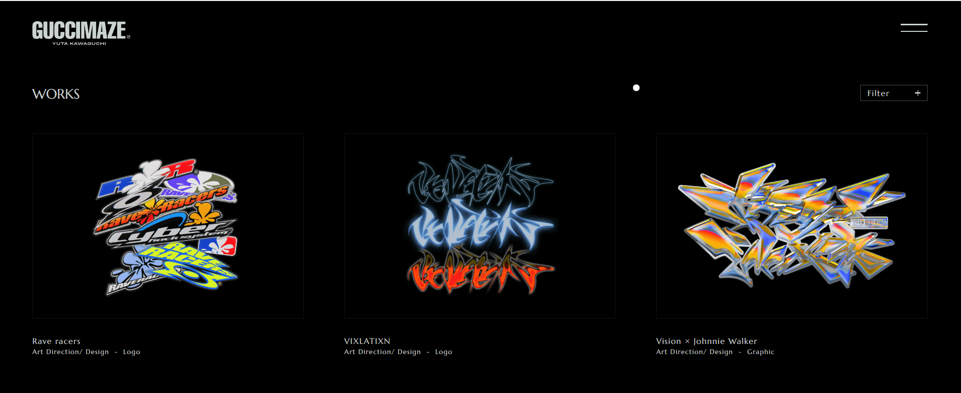
Website2020 – 2024
GUCCIMAZE — Chrome Typography & Core Acid Portfolio
Liquid chrome marks, rave logos and prismatic 3D shards on a black void.
2018 – Present
Warped type, liquid chrome and a grid that refuses to hold
A graphic-culture movement that treats legibility, alignment and restraint as optional — warped and stretched typography, chrome and gradient surfaces, overlapping layers and deliberately unstable composition, carried from club flyers and record sleeves onto the web.
One string, five widths. Distortion along an axis the designer drew stays typography; distortion along one they did not is damage.
Metal is a discontinuity, not a fade. Sharpen the flip and the ramp turns to chrome; soften it and you have a grey gradient again.
Chrome: the value jumps instead of blending.
background: linear-gradient(100deg, #8d97a4 0%, #eef1f6 35%, #7e8794 41%, #ffffff 47%, #79828f 53%, #dfe4ea 59%, #9aa4b1 100%);The same CSS property. One describes light. The other describes a printing fault. Only the second one belongs to this stream.
Live sites that treat alignment, restraint and polite hierarchy as optional — chrome type, campaign chaos and interactive brutalism kept deliberate.
Liquid chrome marks, rave logos and prismatic 3D shards on a black void.
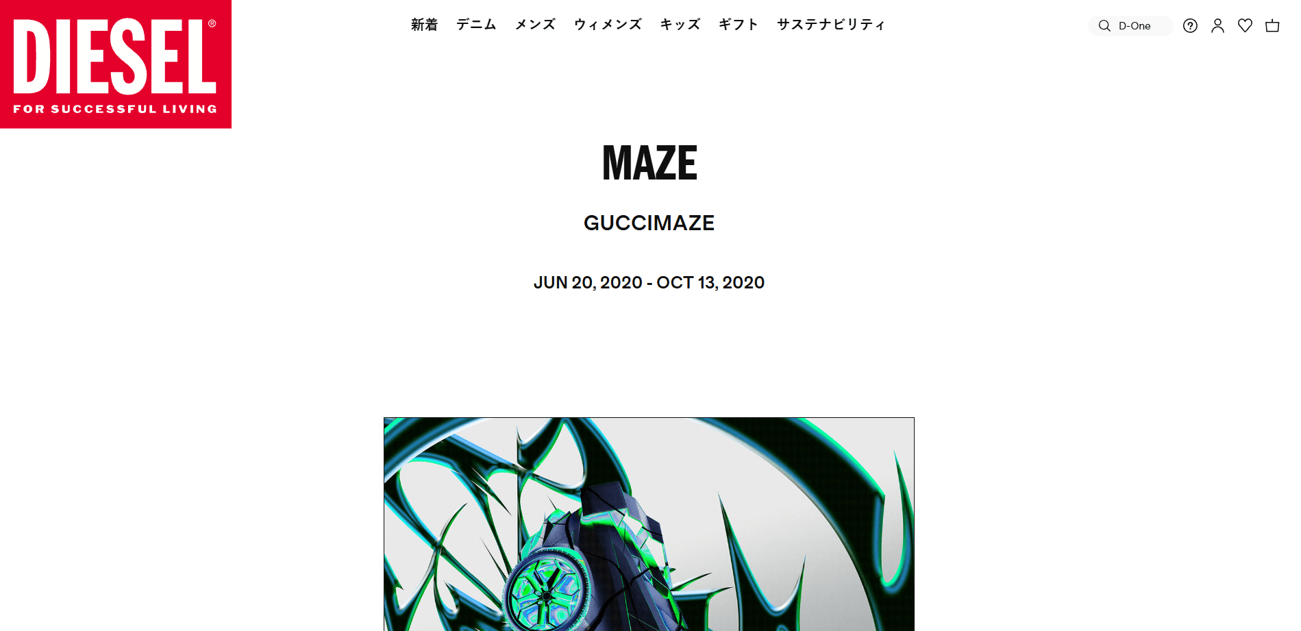
Fashion campaign chrome that borrows acid type and hostile graphic density.
An audiovisual web experience that weaponises acid type against clean modern grids.
The argument is older than the current wave. In the early 1990s David Carson set type in Ray Gun so that it fought the reader, once running an interview entirely in a dingbat font; Neville Brody and the Emigre circle around Zuzana Licko were already treating the grid as something to be broken rather than served; and The Designers Republic built a whole visual language for British techno out of corporate signage turned hostile. That strand acquired the name anti-design: the deliberate refusal of the conventions that make a page easy. The contemporary revival, usually called acid graphics or acid design, arrived from roughly 2018 through club flyers, small record labels and fashion lookbooks circulated on image-first social platforms. Its additions are technical. Cheap access to 3D tools put liquid chrome and extruded lettering within reach of a solo designer; variable fonts made a typeface something you could stretch along an axis rather than distort destructively; and on the web, CSS filters and SVG turbulence made warping a live effect rather than an exported image. Unlike brutalist web design, which strips a page back to unstyled defaults, acid work is maximal: the discomfort comes from too much rather than too little.
David Carson art-directs the music magazine Ray Gun with type that overlaps, breaks and occasionally refuses to be read at all, establishing that a layout can argue with its own reader.
The Sheffield studio builds a graphic language for electronic music out of appropriated corporate signage, dense information graphics and aggressive systems of symbols.
Club flyers, small labels and fashion lookbooks converge on warped type, chrome and psychedelic gradient fields, circulated through image-first social platforms rather than through print.
Stretching type along a weight or width axis stops being destructive distortion, and accessible 3D tooling puts extruded chrome lettering within reach of designers working alone.
Music, fashion and cultural-institution sites adopt the surfaces and the typography while keeping conventional navigation underneath, which is where the style meets its real constraint.
The 1990s music magazine whose art direction under David Carson is the founding reference for treating legibility as negotiable.
The Sheffield studio whose record sleeves and identities gave electronic music a graphic language of hostile corporate signage and dense symbol systems.
The magazine and type foundry through which Zuzana Licko and Rudy VanderLans argued that digital typefaces need not imitate metal ones.
An OpenType capability that exposes weight, width and optical size as continuous axes, turning extreme type distortion into a legitimate typographic operation.
It is unmistakable in a feed. In a period where most commercial design converged on the same neutral grotesque and the same soft card, a warped chrome headline reads as a position rather than a default. It also carries genuine subcultural credibility: the vocabulary comes from music and club graphics rather than from product design, so it signals that a site belongs to a culture rather than to a category. And the tools finally caught up, so the look could be produced by one designer instead of a studio.
It has not declined, but it has a low ceiling. The style is hostile to the things a working site must do — long reading, dense forms, tabular data, translation into other languages — and the same distortion that makes a poster memorable makes a paragraph unusable. Applied broadly it also fails contrast and reflow requirements, so most commercial adoption keeps it to marketing surfaces and hands the rest of the product to a conventional system.
Nothing; it coexists. It occupies the expressive end of a spectrum whose other end is the neutral product design it was reacting to, and most organisations that use it use both.
Acid work keeps alive the argument that a page may be difficult on purpose, and it has pushed variable-font axes, CSS filters and SVG distortion from novelty into ordinary technique. Its more practical legacy is a question every team now has to answer deliberately rather than by default: how much of a site is allowed to be uncomfortable, and which parts are not.
Layouts in which headlines are cropped, overlapped and occasionally set in a dingbat face, published commercially rather than as experiment.
The contemporary centre of the style: warped type over chrome and gradient fields, produced fast and read on a phone.
Extruded metallic lettering rendered in 3D and composited over psychedelic gradients — the surface most associated with the current revival.
Anti-design is not the absence of design: producing a convincingly unstable layout takes more decisions than a conventional one, not fewer.
It is the inverse of brutalist web design — brutalism removes everything, acid adds everything, and both arrive at discomfort.
Variable fonts made distortion respectable: stretching along a designed axis keeps the letterforms drawn rather than smeared.
The chrome is almost never a photograph; it is a gradient ramp with a hard light band, which is why it reproduces so cheaply on the web.