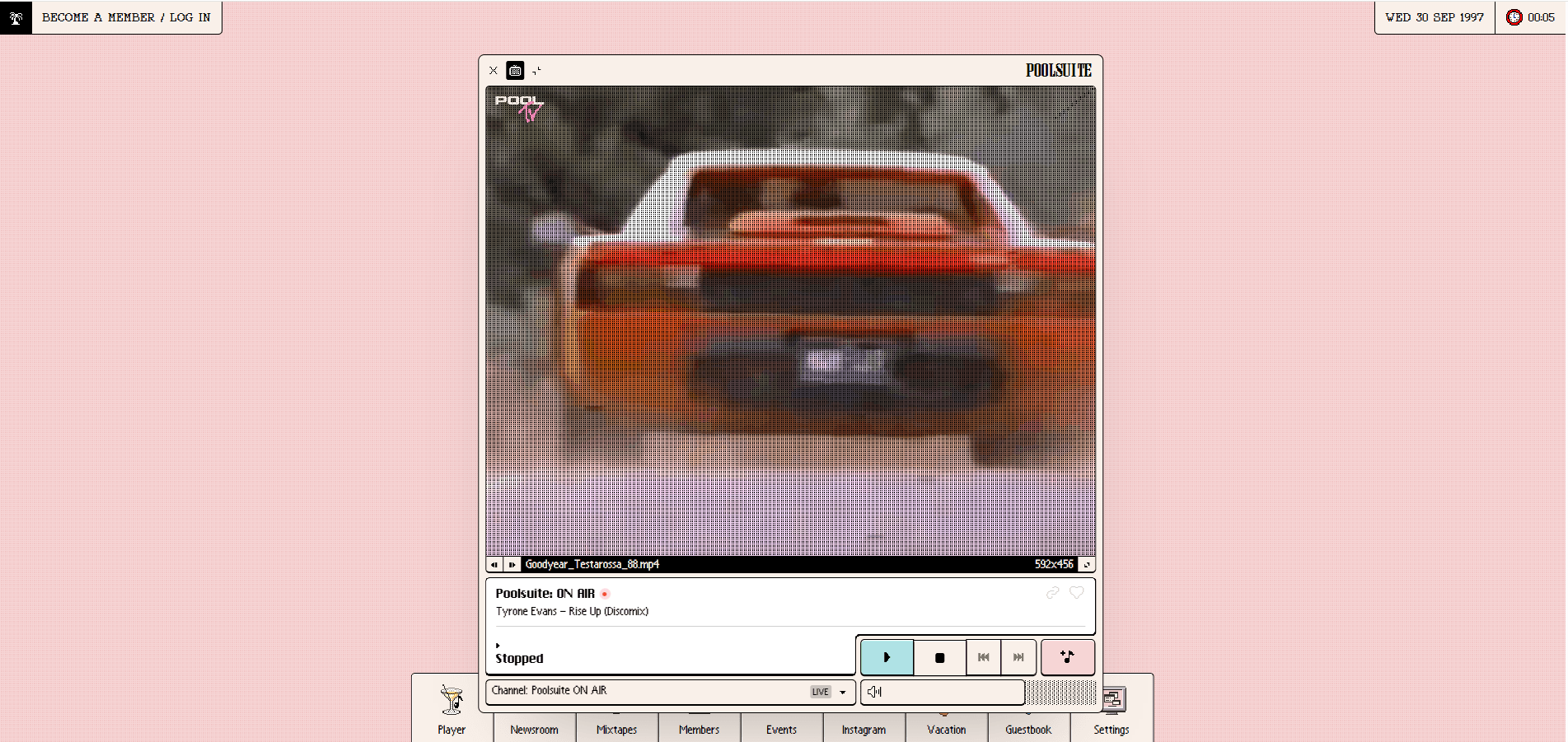
Website2014 – 2020
Poolsuite FM — Retro Mac OS & Leisure Aesthetic
A streaming lounge wrapped in Classic Mac windows, palms and poolside chrome.
2012 – 2018
The 1990s desktop remembered after it was abandoned
An internet aesthetic that began as a music genre and became a visual language — Windows 95 chrome, classical statuary, katakana, perspective grids and VHS decay, assembled into a nostalgic and faintly melancholy picture of a commercial future that never arrived.
No mesh, no renderer, no image. Two repeating gradients and one perspective transform — the whole landscape.
Short perspective: the lines converge hard, which is the 1980s demo look.
background-image:
  repeating-linear-gradient(0deg, rgba(1,205,254,0.55) 0 1px, transparent 1px 44px),
  repeating-linear-gradient(90deg, rgba(1,205,254,0.55) 0 1px, transparent 1px 44px);
transform: perspective(280px) rotateX(64deg);
top: 56%;Y2K looks forward at consumer technology and is optimistic about it. This looks back at the same machines and finds them switched off.
Live recoveries from a desktop nobody uses any more — leisure Mac chrome, Windows 95 radio hubs and the pastel grammar of 90s nostalgia after the fact.
A streaming lounge wrapped in Classic Mac windows, palms and poolside chrome.
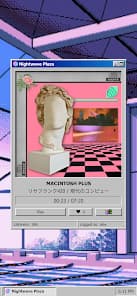
24/7 vaporwave radio inside bevelled Windows 95 chrome.
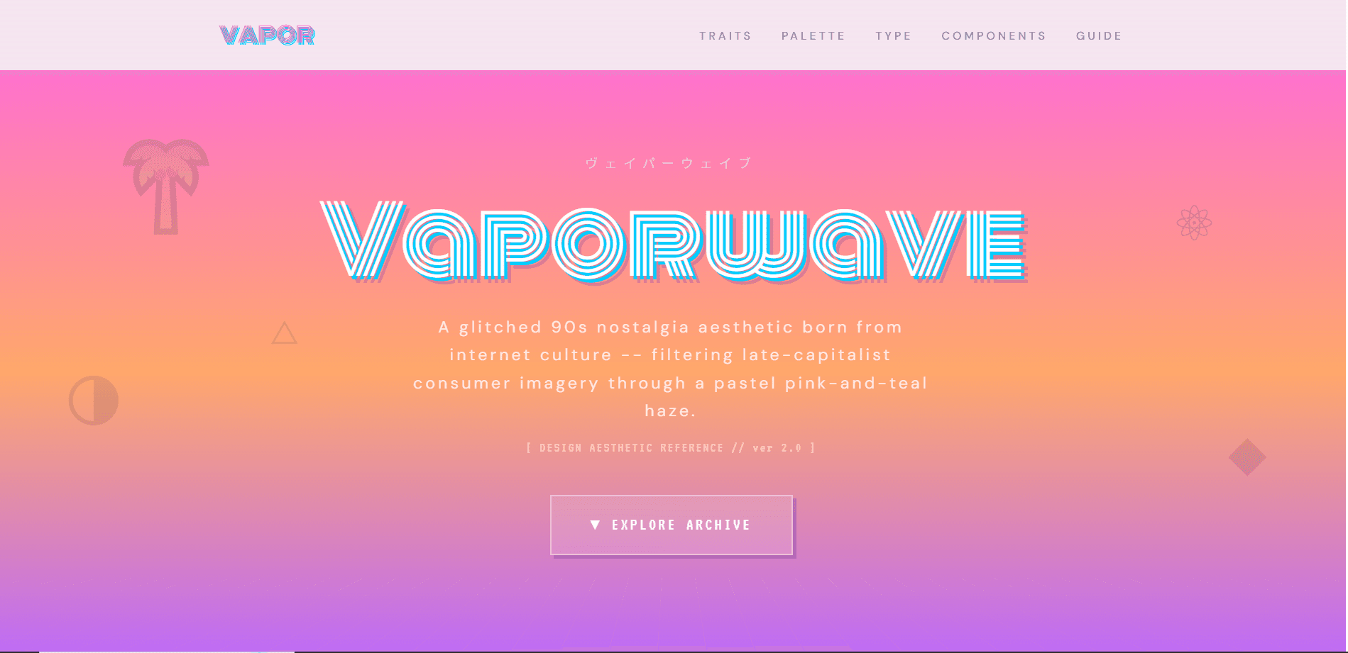
Striped cyan title, katakana eyebrow, palm icons and a receding grid horizon.

Six scanlined principle cards on a dark purple field — irony, degradation, obsolete tech.
Vaporwave started in music. Chuck Person’s Eccojams Vol. 1 in 2010 and Macintosh Plus’s Floral Shoppe in 2011 built tracks out of slowed, looped 1980s pop and corporate muzak, and the visual language followed directly from the records. Floral Shoppe’s cover — a Greek bust, a checkerboard floor, a magenta field and Japanese characters — became the most reproduced image the aesthetic has. What the style borrows is specific and consistent: the graphical furniture of early consumer computing, which by 2010 was recent enough to be remembered and old enough to be gone. Windows 95 and 98 chrome, early 3D and Deluxe Paint gradients, mall food-court signage, Japanese packaging from an era when Japan represented the technological future, and the compression artefacts of the media it all reached people through. The mood is the point, and it is not the mood of Y2K. Y2K looked forward at consumer technology and was optimistic about it. Vaporwave looks back at the same decade, finds the mall empty and the software abandoned, and is ambivalent about the commercial optimism it is quoting — which is why irony and melancholy are as much part of the style as the pink and the cyan.
Chuck Person releases an album built from slowed and looped 1980s pop, establishing the method — existing commercial media, decelerated until its optimism sounds strange.
Macintosh Plus releases the record whose cover — classical bust, checkerboard floor, magenta field, Japanese text — becomes the single most reproduced vaporwave image.
Image boards and microblogging platforms spread the vocabulary independently of the records, and it becomes a way of composing pictures rather than a genre of listening.
Advertising and fashion adopt the surfaces, and the aesthetic starts to be used to sell the same kind of product it was originally quoting, which the scene reacts against.
The specific movement disperses, but its components — perspective grids, retro system chrome, VHS decay — settle into the general visual toolkit of online culture.
The 2011 Macintosh Plus album whose cover art is the canonical vaporwave image and the origin of the bust-and-grid composition.
The source of almost all the interface furniture the aesthetic quotes: bevelled title bars, system dialogs, the taskbar and the default desktop.
Where most vaporwave was actually released, in tiny runs with cover art that carried the visual language as far as the music did.
The circulation layer that separated the imagery from the records and turned it into a shared compositional grammar.
It gave a generation a way to be nostalgic about something it had only half-experienced, and to be ironic about it at the same time. The components were also unusually easy to obtain: screenshots of an obsolete operating system, public-domain sculpture, and a gradient anyone could make. That low barrier meant the aesthetic could be produced by people who were not designers, which is exactly why it spread as fast as it did.
Saturation and commercial capture. Once the surfaces were being used to advertise the kind of consumer product the aesthetic had been quoting ironically, the irony stopped functioning. The vocabulary was also narrow — there are only so many busts and grids — so it exhausted its own repertoire faster than a design system would.
No single successor. Its components dispersed into a wider retro-digital idiom, and its interest in degraded media carried into later internet aesthetics that quote the 2000s rather than the 1990s.
Vaporwave established that an interface can be quoted as a cultural object rather than used as a tool, and that obsolescence itself can be a design material. It is also the reason a perspective grid over a sunset reads instantly as a period reference rather than as a geometric background, and the reason a screenshot of an old operating system now carries emotional weight it did not have when the software was current.
2011
Bust, checkerboard, magenta field, Japanese text: the composition every later vaporwave image is measured against.
Stacked system windows, dialogs and error boxes arranged as a picture rather than as an interface anyone could operate.
Empty retail interiors adopted by the scene as the real-world counterpart to an abandoned desktop.
The wide letter-spacing is a side effect of encoding: writing Latin in fullwidth CJK characters spaces every letter to a square cell, and designers kept the look after dropping the trick.
The classical busts are usually plaster casts of well-documented sculptures, which is why the same few faces recur across thousands of images.
It is one of the few aesthetics where the compression artefact is deliberate — the JPEG damage is part of the picture, not a flaw in it.
Vaporwave and Y2K quote the same decade from opposite directions: one is nostalgic for the future the other was optimistic about.